Analytical dashboard
An analytical dashboard enables users to analyze trends, patterns and metrics effectively. You can use this to present data in a hierarchical and intuitive manner.
The mock-ups displayed in this pattern are available as templates in Figma (J.P. Morgan employees only).
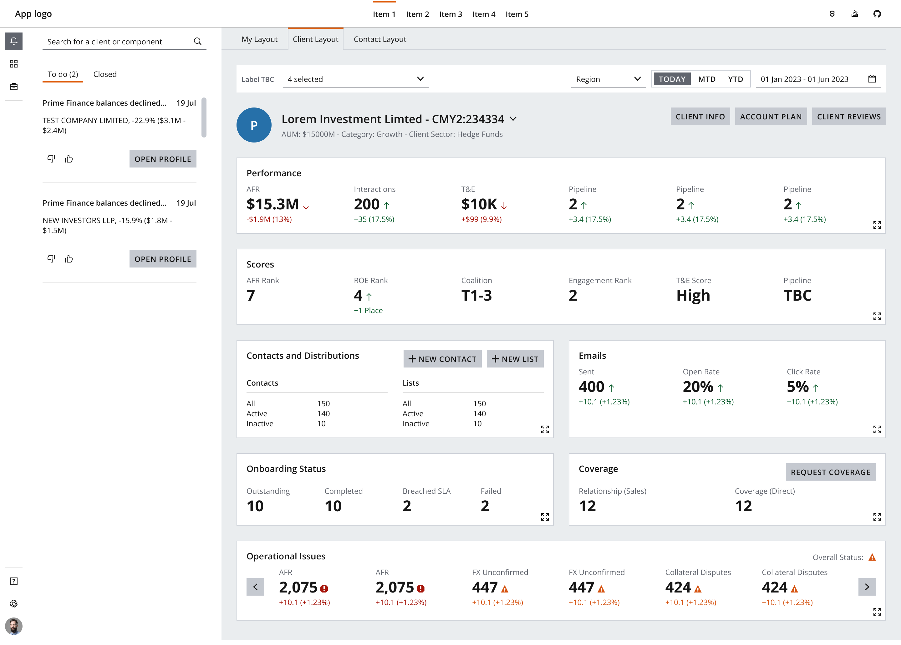
Use an analytical dashboard when the page needs a top-level dashboard shell with a clear main body region and supporting regions for metrics, controls, and persistent panels.
Use it to visually present data that provides insight and analysis of key metrics and performance indicators. Combine multiple data sources and present information in a concise, interactive format using charts, graphs, tables, and other visual elements.
Use the pattern when the user needs to:
- Data-intensive environments.
- Performance tracking.
- Risk assessment.
- Investment analysis.
- Client reporting.
- When the page is a simple presentation surface without a dashboard shell or main body region, use a smaller pattern instead.
- When the content is mostly a single simple metric, use Metric.
- When the content is primarily a simple table or interactive grid, use Table or Data grid.
An analytical dashboard is easiest to build when the named regions are explicit and the shell layout is separated from the main content area.
- Dashboard header: The top region introduces the context of the dashboard and can contain branding, status, or summary actions.
- Key metrics: A compact strip of metric cards or metrics highlights the most important values first.
- Fixed controls or filters: Persistent controls sit outside the main body so the user can refine the data without losing context.
- Main analytical body: The main content area contains charts, tables, or other widgets that provide the detailed analysis.
Other features typically found in an analytical dashboard include:
- Data grid or table: Provide tabular views of data for more detailed analysis. Use a simple table for structured read-only data and Data grid when the table needs interaction.
- Tooltip: Offer the ability to drill down into more granular data from summary views and view additional information. Users should have access to specific data points and their underlying details.
- Text: Clearly display information about the data sources, update frequency, and any disclaimers related to data accuracy.
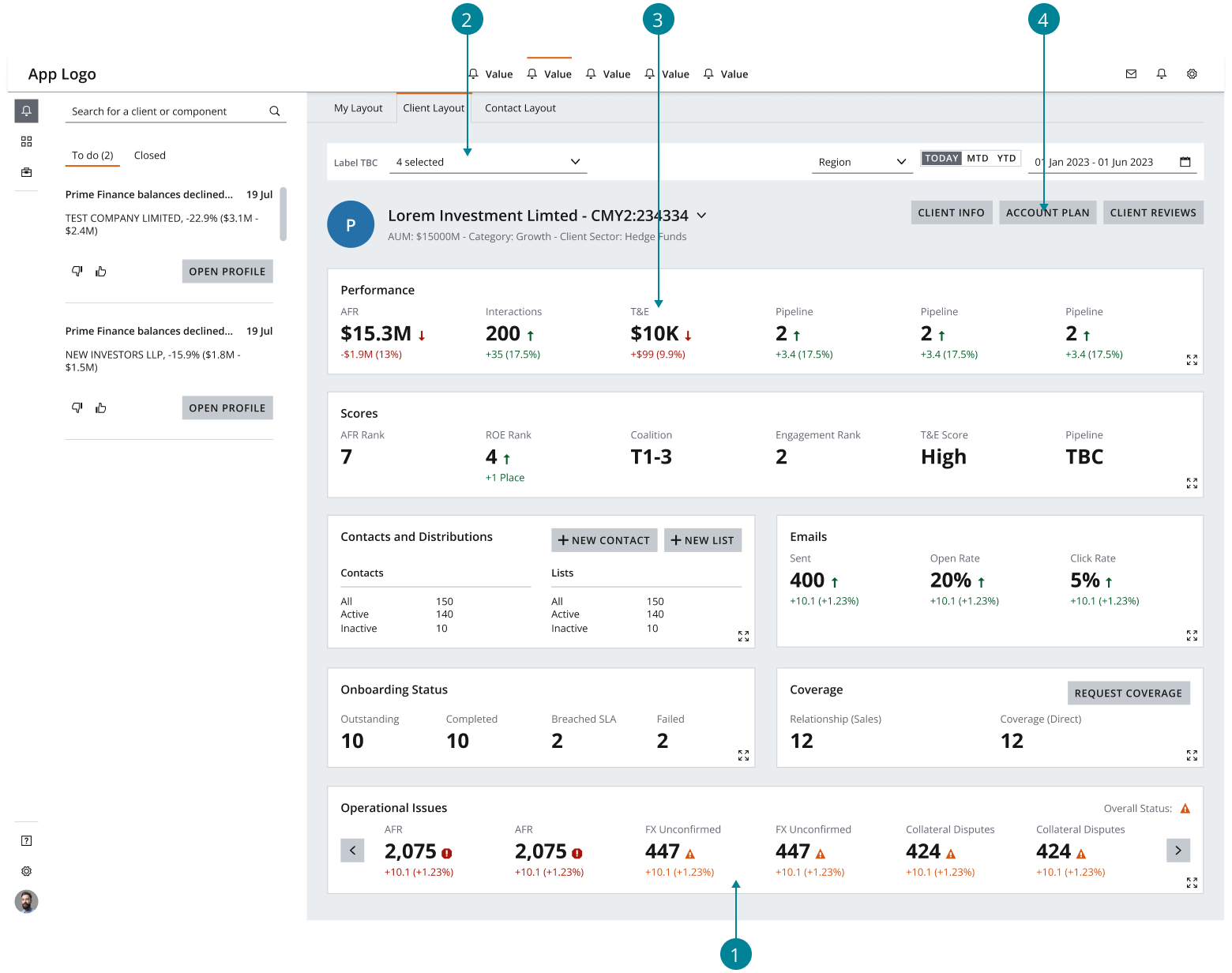
Ensure that the dashboard is responsive and can adapt to different viewport sizes and devices. Salt provides layout grids as a starting point for designing any user interface that achieves effective alignment and consistency for your dashboard design. View the Salt Layout Grid library for grid templates across different densities.
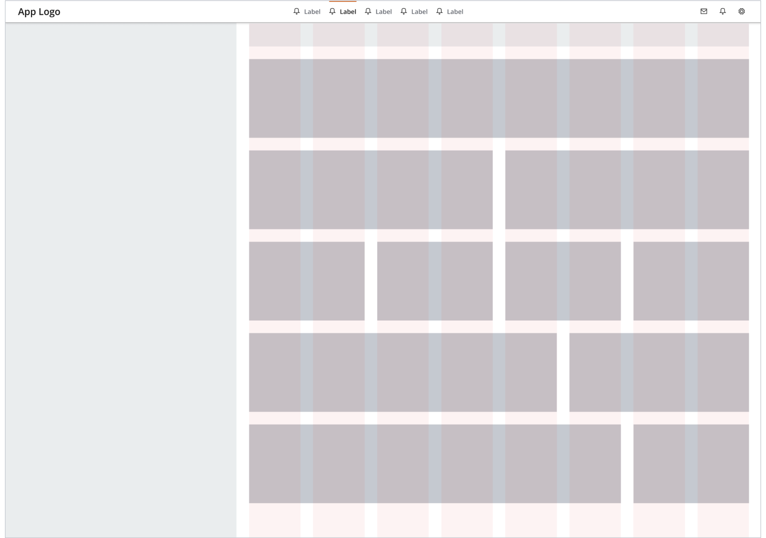
The following examples use a desktop screen size of 1440 x 1024px and a large, eight-column grid in medium density. The gutters and margins for Salt layout grids are --salt-spacing-300 across all densities.
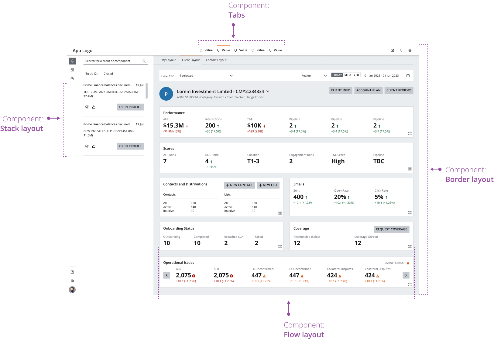
BorderLayout: Use the border layout component to manage the top-level layout of the dashboard, including header, footer and navigation panel elements.FlowLayout: Use for small-scale layouts that require components (such as cards) to be displayed in a responsive row.StackLayout: Use for small-scale layouts that require displaying components in a single row or column and may benefit from the supported visual separators.Tabs: Use to organize and categorize dashboard widgets into local groupings. You can also organize content into multiple dashboards using tabs, each focusing on a specific aspect or topic. This keeps the interface clean and prevents overwhelming users with too much information.GridLayout: Use to manage the layout and responsiveness of the main content area in your dashboard.
Use the F-shaped pattern to guide the user’s focus through the most important widgets on the dashboard. This supports efficient discoverability of elements such as the dashboard’s global controls and main analytical body.
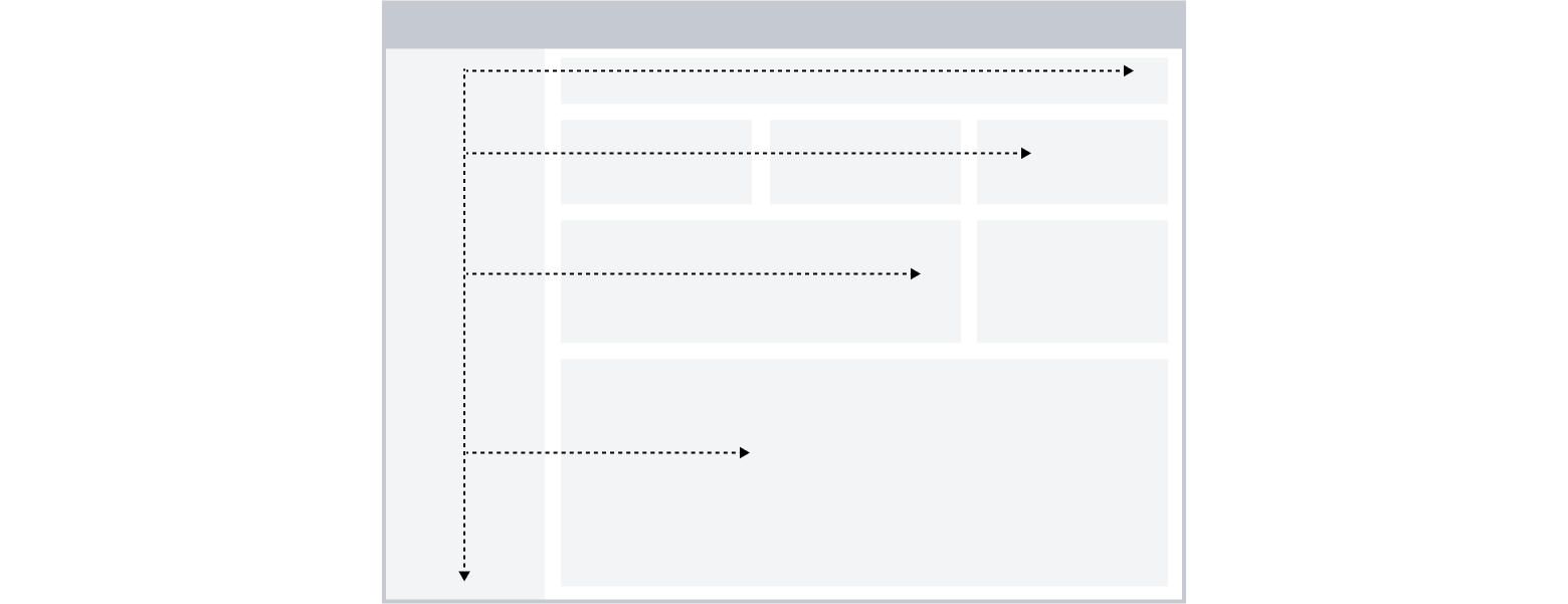
When considering the visual hierarchy of an analytical dashboard, ensure the most important widgets on the page draw the user's attention. This usually follows this order:
- Dashboard header
- Key metrics
- Fixed controls or filters
- Charts, graphs, tables, or data grids in the main analytical body
- Use
Drawerfor temporary overlays that do not own the dashboard layout. - Keep persistently displayed panels in the west region of the border layout so they stay visible without hiding the main analytical body.
- Use
BorderLayoutfor the top-level shell andGridLayoutfor the main analytical body. - Keep metrics visually compact and keep the main analytical body focused on analysis, not navigation.
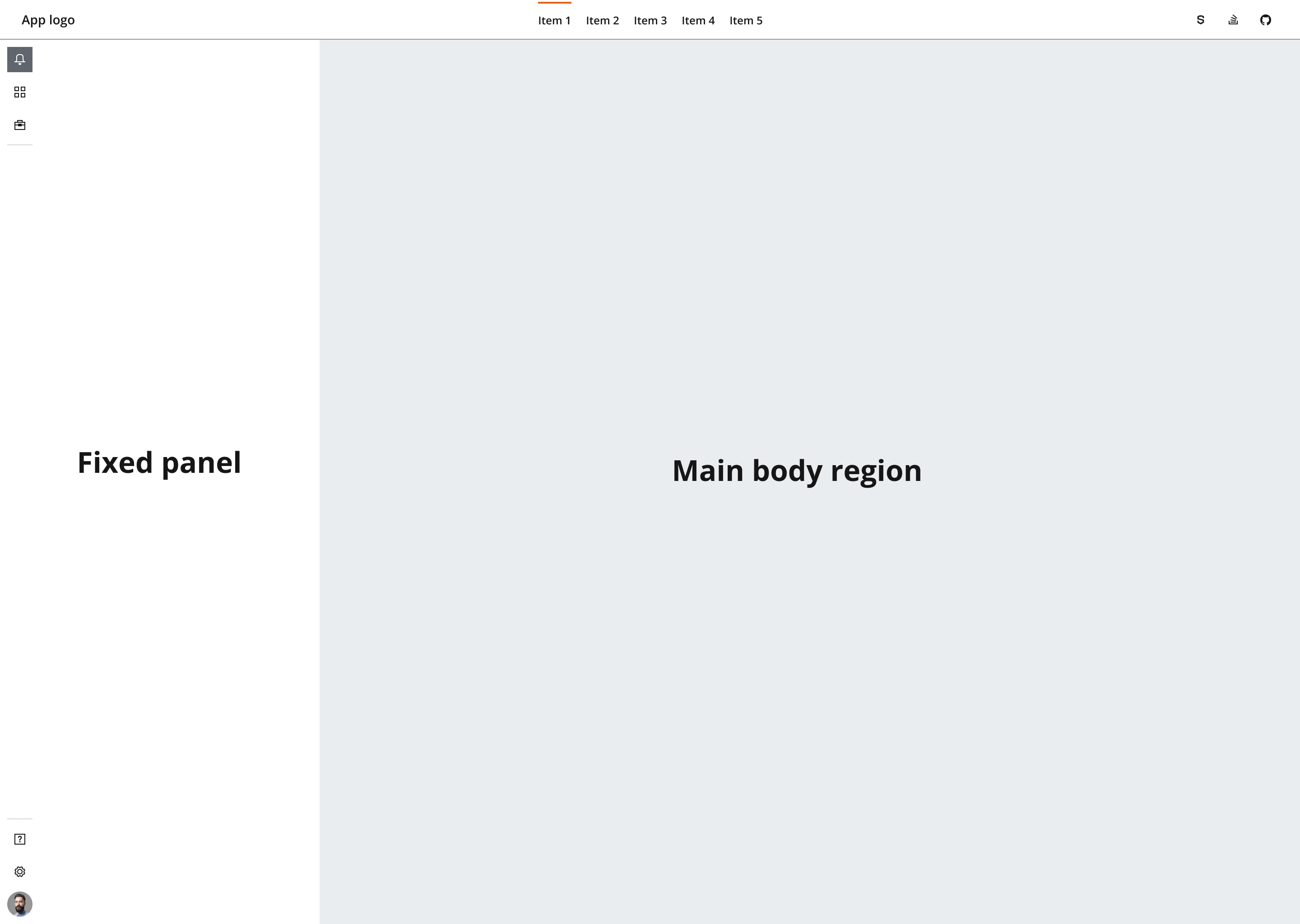
In a partially aligned layout, the main body of the dashboard aligns to a layout grid and combines with surrounding fixed-width panels.
If your dashboard is responsive, the main body region will dynamically resize at different breakpoints. The fixed panel remains the same when the user resizes the viewport, but you can set it to the width of your choice based on desired outcome. Consider the different content types, density and target screen size when making your decision.
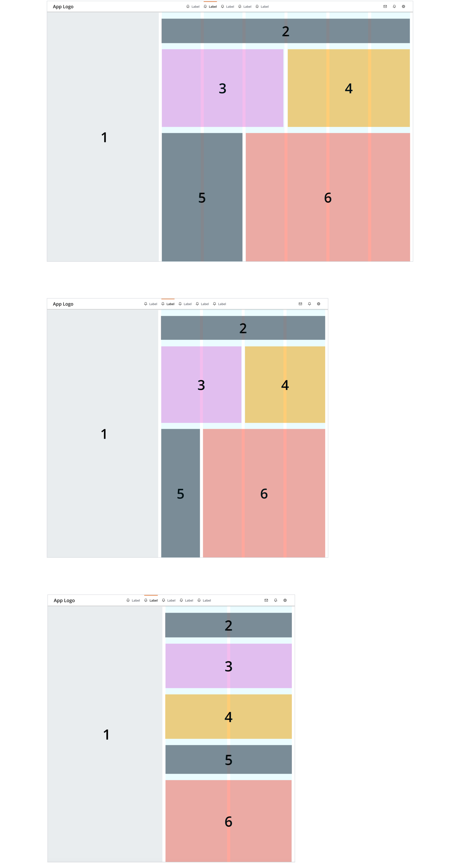
In a fully aligned layout, the main body of the dashboard and surrounding panels all align to a layout grid.
If your experience is responsive, use the underlying layout grid to set a minimum width for your surrounding panels and adjust your content area based on your predefined breakpoints.
If your experience has a fixed resolution (i.e., isn’t responsive), users can continue to use a layout grid to design consistent layouts.
In the following example, the panel width aligns to the first two columns of the underlying layout grid.
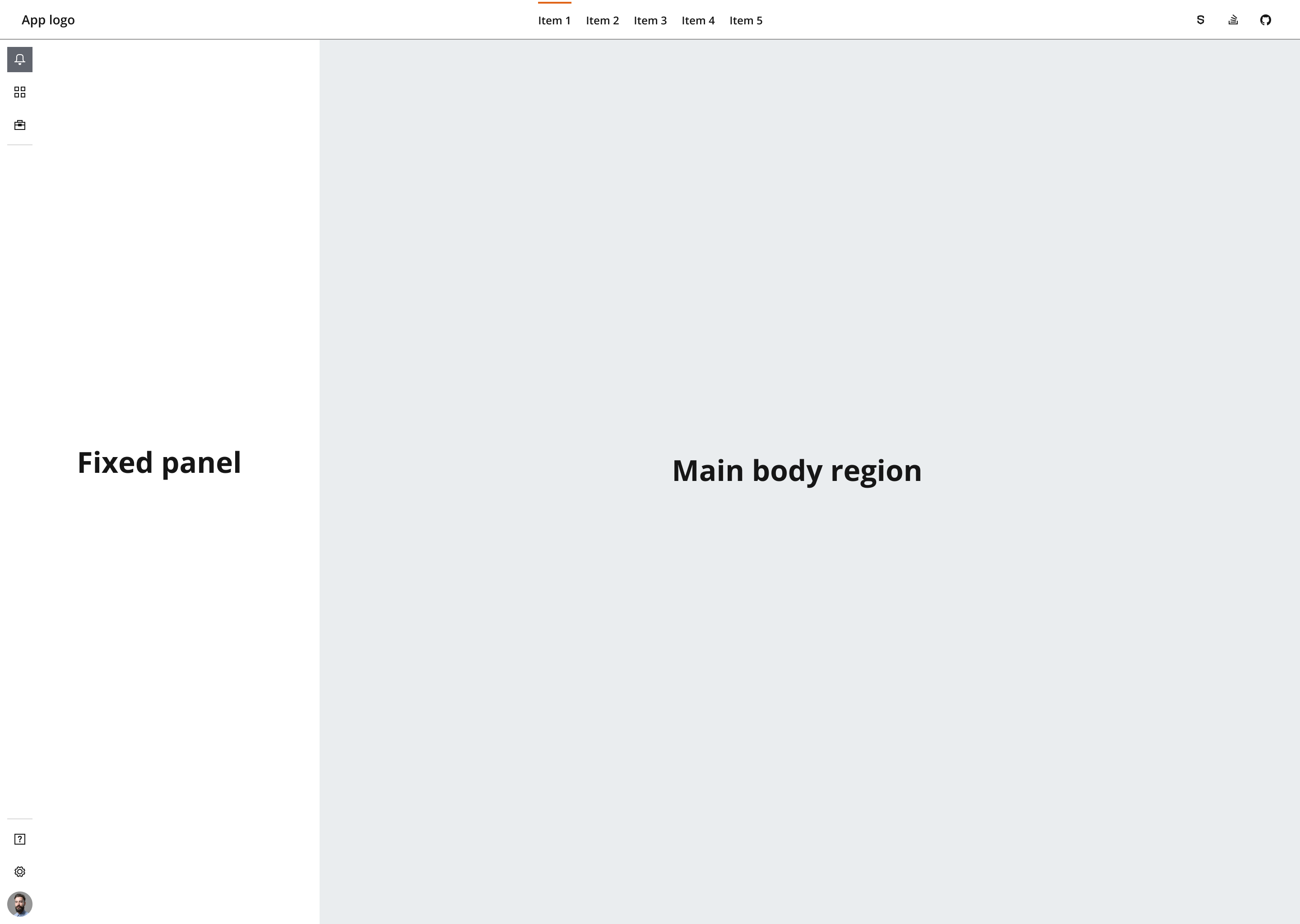
From a high-level overview, the main content regions of an analytical dashboard are:
- Main body region
- Header region
- Fixed panels
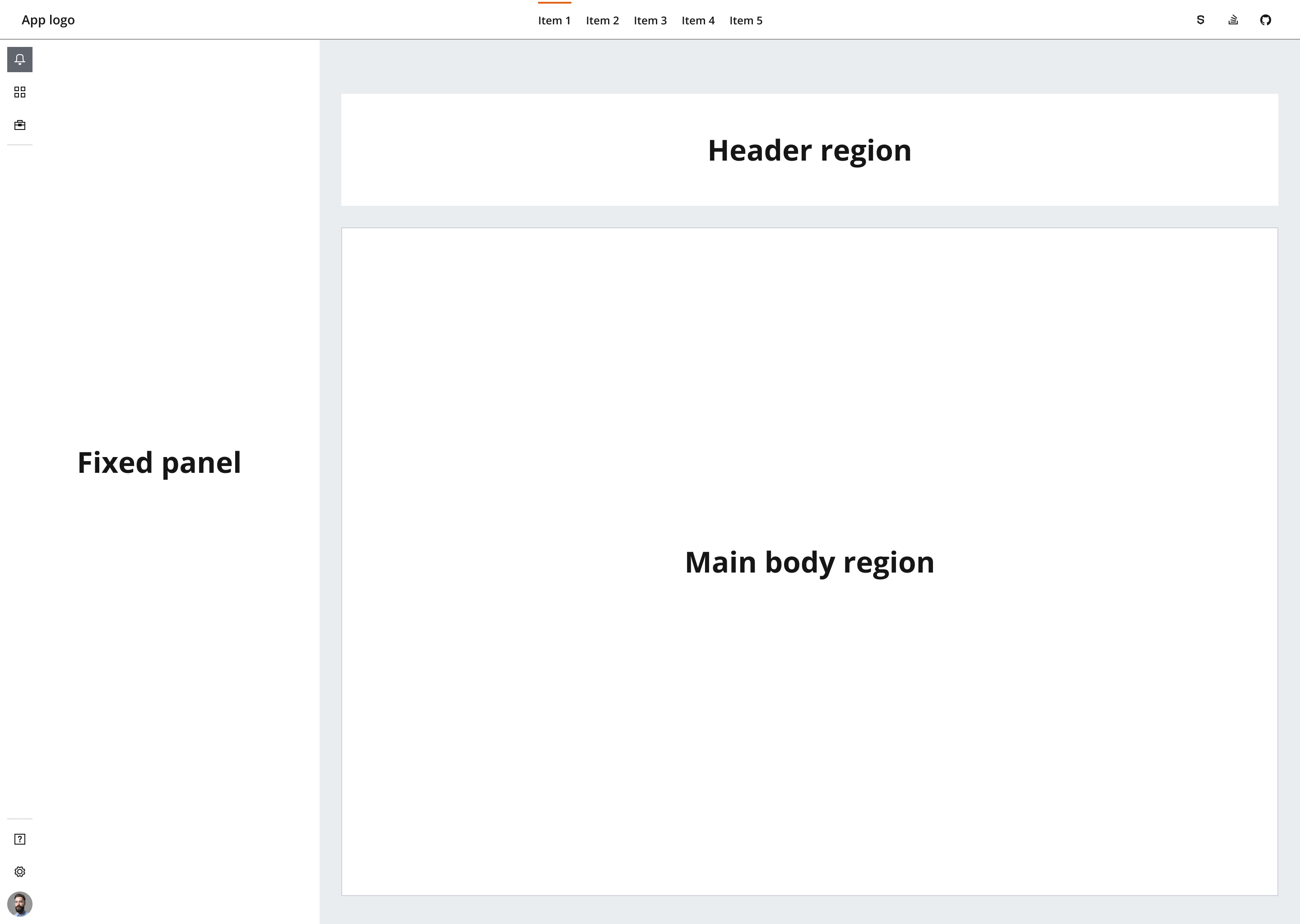
The main body region contains the dashboard modules, widgets, and detailed analysis content.
It is the region that GridLayout should manage. Keep BorderLayout for the outer shell and use the main body region for the modules that change with the data.
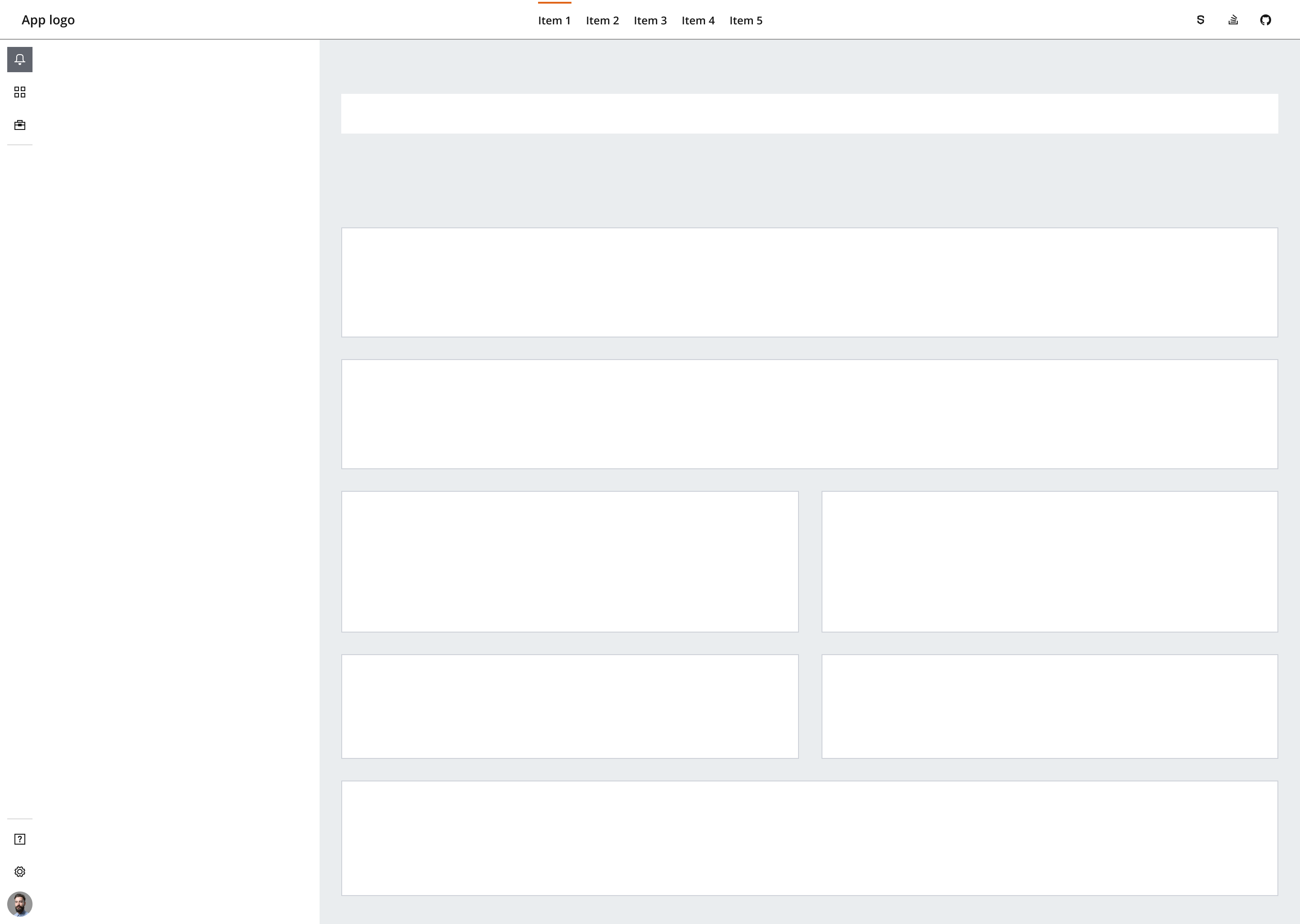
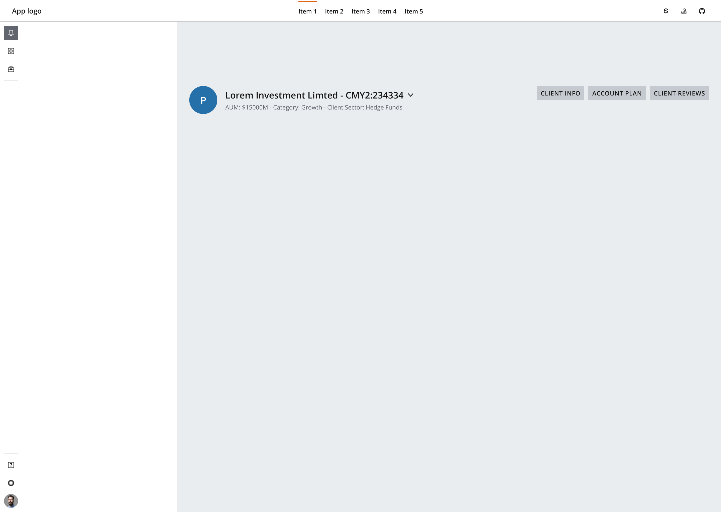
The dashboard header sits at the top of the dashboard body, and its content can be flexible in use. For example, a header can introduce the context of the dashboard, contain information about the latest dashboard update or display personalized user information.
The fixed panel typically contains functionality for user actions that need to be easily accessible. This varies per dashboard but can include components such as filters, toggles, and controls. These allow the user to manage the data displayed within the main body or go to multiple dashboard pages.
You can place fixed panels vertically or horizontally within a dashboard, depending on the context.
The below example displays a fixed panel to the left-hand side.
You can use a fixed panel to:
- Accommodate for extensive functionality or a limited amount of user actions, such as search and/or filtering.
- Contain buttons that link to multiple pages in a dashboard.
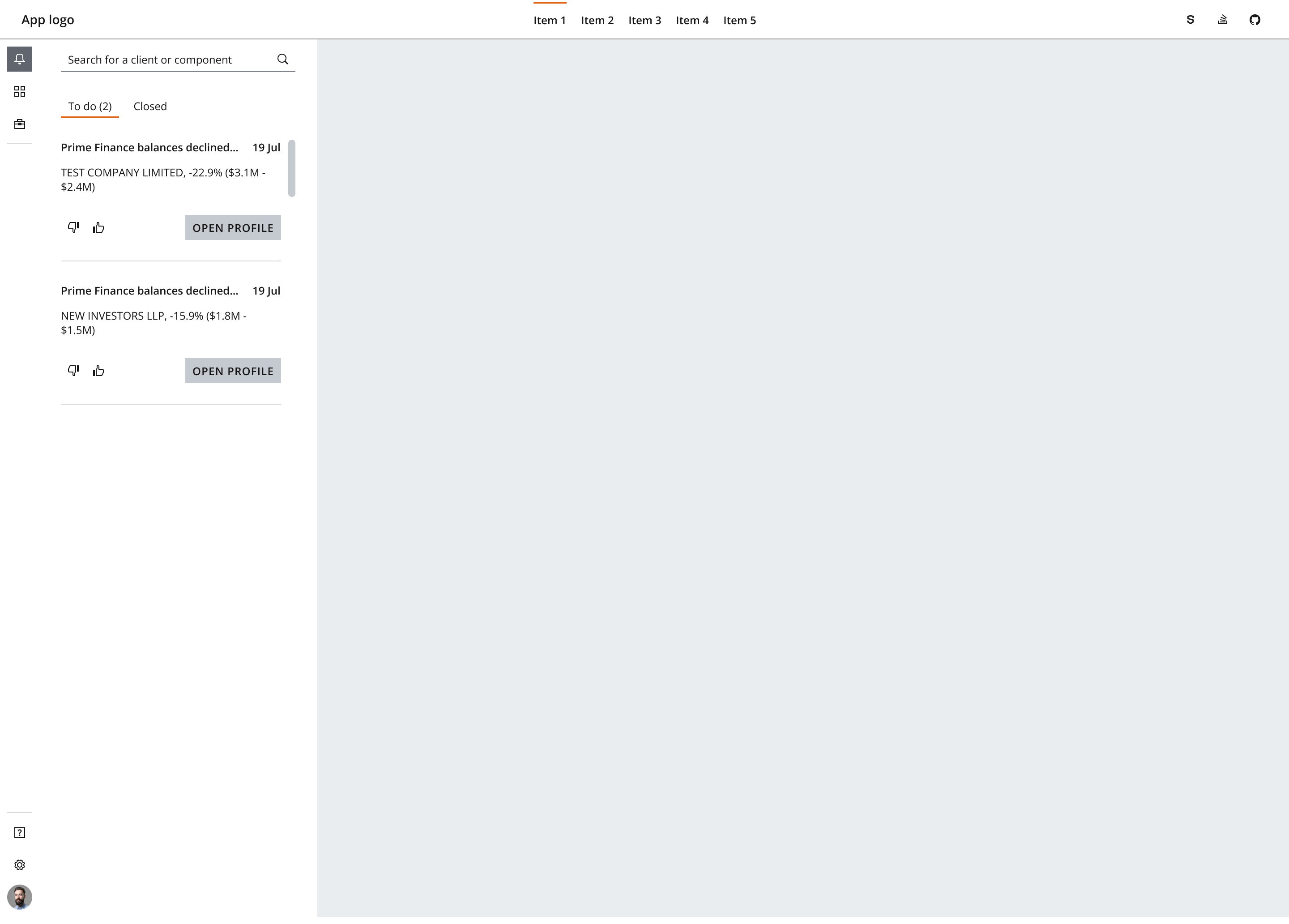
- The width of a fixed panel depends on the content within it. As a general rule, size the width of the panel to a grid depending on the size of the interactive elements within.
- Generally, we recommend driving the content spacing by following the spacing baked into Salt components and applying
--salt-spacing-300between elements as the default spacing in the chosen density. Tighten as required for more condensed areas. - Use the spacing foundation for further guidance on how to apply spacing.
- Fixed panels should remain fixed in position while scrolling the dashboard.
Use Card as a container or widget type to position and convey forms of data, such as charts and grids, within the main body of the dashboard. You can easily arrange and manipulate cards—they're a good choice for a responsive design as you can easily scale them.
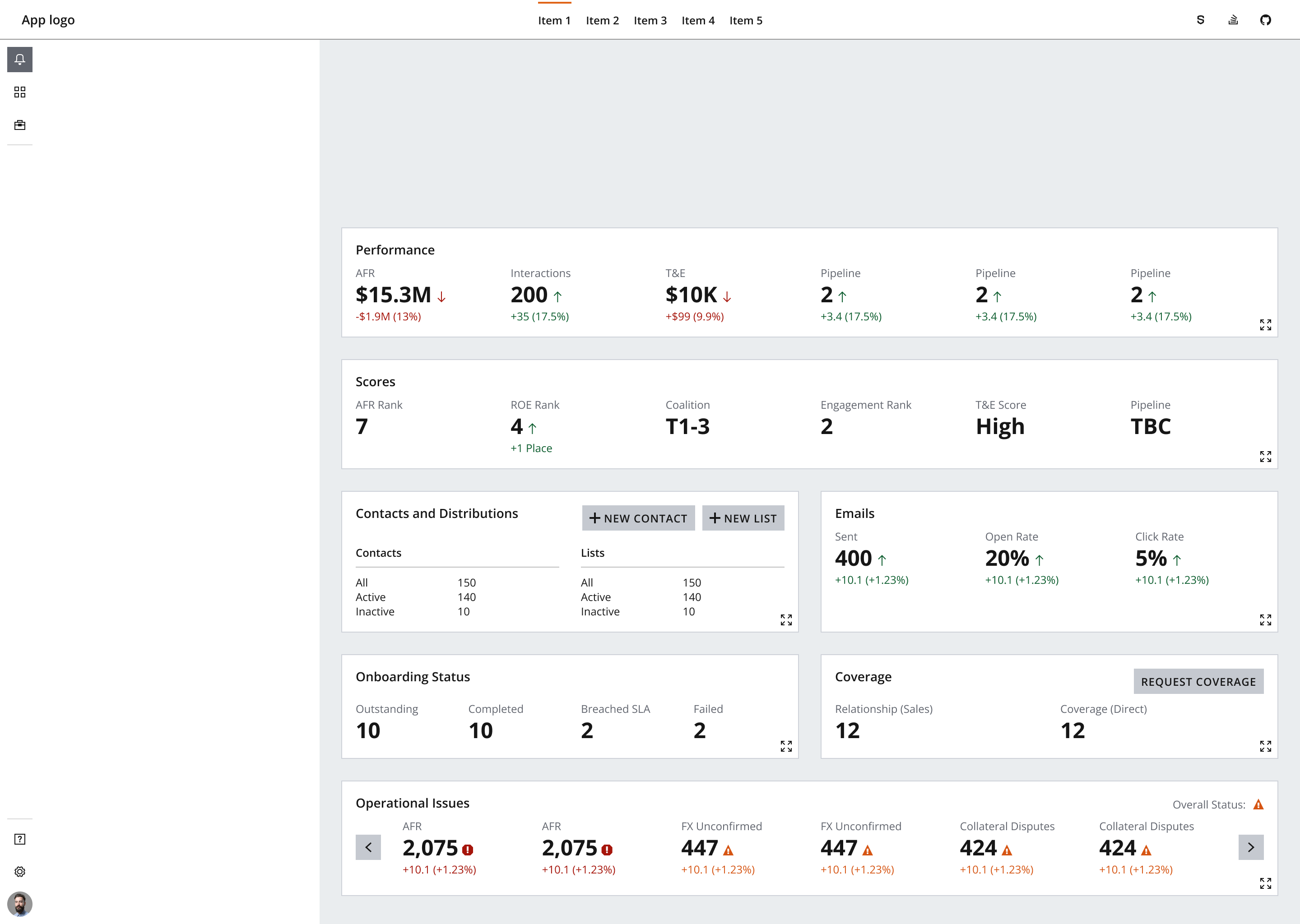
Keep the content layout within individual cards as consistent as possible across the dashboard. This supports scalability, especially if main components anchor to familiar locations within a card.
- We recommend you style cards with the
--salt-container-primary-backgroundtoken, and the application with the--salt-container-secondary-backgroundtoken. This is the most effective way to present data, as it provides the highest contrast between visualizations and their immediate backgrounds. - (J.P. Morgan employees only) For styling data visualizations such as charts, follow the UITK guidelines on data visualization, where you can find further information on presenting data in a visually cohesive manner. We recommend using the categorical color palette within your dashboard design, as it’s ideal for visualizing distinct groups of items.
- As default, use
--salt-spacing-300between content modules such as cards to promote readability. - The default padding between modules is
spacing-300. Depending on the needs and business context of the dashboard, you can change this spacing token if your dashboard needs to display more or less content. View the spacing foundation for further guidance. - Group contextually related content together where possible.
- Order modules from level of priority—which data would the dashboard user consider to be primary vs. secondary?
Depending on the amount of data that the user needs to see at once, you can arrange content modules in various layouts alongside common dashboard features, such as fixed panels and key metrics. However, it’s important to not overwhelm users with data; otherwise, it will be hard for them to focus and get a clear overview.
Use the flexibility of the columns in a layout grid to split and arrange cards in various horizontal alignments.
A metrics bar is a common example of a dashboard module. It’s a flexible structural attribute that allows highlighting broader level metrics to help provide the user with additional context. It's often positioned horizontally higher up on a dashboard to further emphasize the metrics' importance.
Metric bars should remain clean and concise to provide a higher level oversight of information. Try to adhere to the Law of Proximity and avoid overloading this space with excessive information. Aim for no more than 3–6 key metrics on display, and group contextually related metrics together where possible.
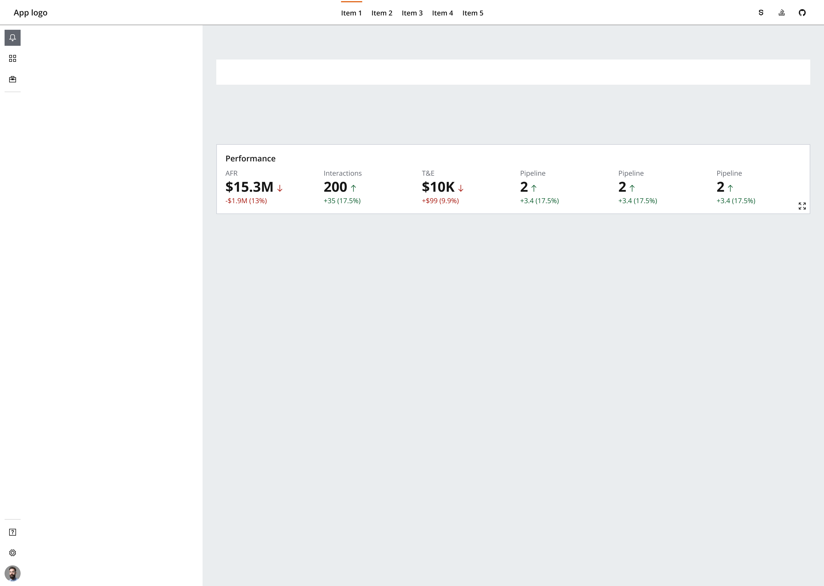
- Position key metrics in a horizontal layout and apply vertical
--salt-spacing-300between them to promote readability. - Use a horizontal container spanning the width of the main body of the dashboard to evenly space out and position a set number of metrics.
- Layout is flexible depending on the dashboard grid. A metrics bar can span the full width of a dashboard (e.g., over 12 columns) or follow a
SplitLayoutusing the remaining number of available columns across the main body of the dashboard. Use theStackLayoutorFlowLayoutcomponents to organize the layout within a metric bar depending on whether metrics should wrap or scroll within a module.
If you need to expand the pattern or share feedback with us, please contact the team.