Content status
A content status communicates loading, empty, warning, error, and success states inside a container component or bounded content region. Use it to keep state messaging attached to the content the user is already working with.


Use this pattern in a container component when the state belongs to the content area itself:
- When a bounded region or local content area needs a loading, empty, warning, error, or success state.
- When content is loading.
- When a container has no data to show and you need an empty-state message.
- To share information, warnings, or errors with users that relate to the current content area.
- When the user has successfully submitted content or completed an action.
- When the message should reach across the app or the whole page, use Banner or Toast instead.
- When the state requires a full workflow interruption or a decision, use Dialog or the owning form pattern instead.
- When the state is not tied to a container, use inline text or another component instead.
The content status consists of three functional areas:
- Visual indicator: Content status can use
StatusIndicator,ProgressorSpinnerfor its visual indicator. - Text: Text elements serve as supporting messages.
- Button: Buttons are optional and can be added to reload content or perform a custom action.

- Use
StackLayoutto display the two lists and move buttons that make up list builder in a row formation. - Use
Text,ButtonandInputto assemble the header area. - Use
StackLayoutto orient the move buttons between the two lists in a column formation.
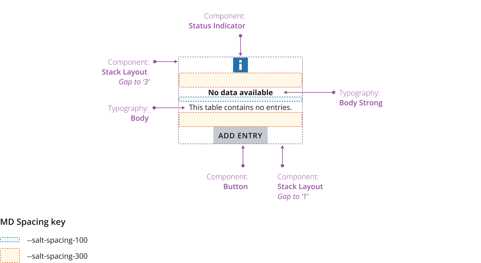
- Text line length shouldn't exceed 80 characters. See the typography foundation for more information.
- You should horizontally and vertically center the pattern in the container.
- Have a clear hierarchy: Your titles should be stand-alone, revealing key information your users need to know without relying on the supporting message, which users may skim over, e.g., “Login required.”
- Be helpful: If it’s possible for your users to resolve or rectify an issue, make sure you state this clearly, e.g., “You can log in to access this data.”
- Keep it simple: Try to limit titles to a single line and supporting messages to no more than three lines.
We've used a progress component in this example to help manage user expectations. If you know how much of a current process is complete, use this to communicate that information.

We've used a spinner component to reassure users in this example. Use this to let your users know that content is loading or processing without sharing an exact time frame.

Use this variant to communicate useful information. For example, if there’s no data available, this variation can communicate an empty-state message and let users know why they can't see any content.

Use the warning status to inform users of an issue or potential issue related to their current task. Use this for issues that don't prevent the user from continuing or completing their task. This could include a system status that may cause issues at a later point.

Use the error status to communicate a critical issue that prevents the user from continuing or completing the task. This could include missing content or user information required.

Error and warning messages should:
- Notify users when there’s an issue.
- Identify and explain the issue.
- Provide a resolution.
This example lets users know that content has been successfully processed, e.g., the user has completed and submitted a form.

Use the label only content status when you:
- Have limited space.
- Don’t want to display spinners due to performance concerns, e.g., on low performance devices.
- Want to avoid busy visual UI and animations.
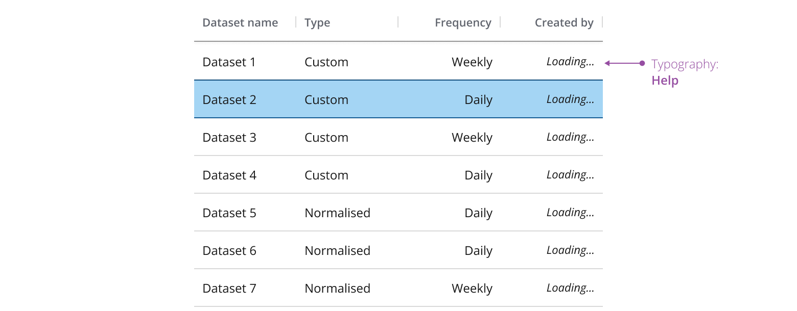
For example, use for displaying a loading status in a data grid or in a combo box list.
If you need to expand the pattern or share feedback with us, please contact the team.