Metric
A metric displays an important number or summary value prominently. You can add labels, indicators, or trend context to help interpret the value.


Use the pattern to give more prominence to a single key measurement or a small number of related measurements. Metrics often serve as building blocks in dashboards, where they direct users to key information that they may otherwise overlook.
Use it when:
- you need one prominent value with a subtitle, subvalue, or indicator
- you need a single KPI-style summary with a label and optional trend or direction indicator
- the metric should act as a dashboard building block rather than the primary page container
- the layout should stay compact and oriented around a single value or a short metric group
You can add multiple metrics to your UI if needed. Visual differences, like size and positioning, can help users understand which metrics are most important.
- When the page needs a full dashboard shell, use Analytical dashboard.
- When you need charts or tables as the primary content, use the relevant visualization component or pattern instead.
- When the value is not the main point of the UI, use a text or content component instead.
- Place metrics higher in your layout when you want to emphasize their importance.
- Never leave the user guessing how to interpret your metric. Make sure you provide enough context, and use subtitles and indicators to minimize ambiguity.
- Keep titles and values as short and concise as possible. Round or truncate values to significant figures, and use common abbreviations instead of spelling out words.
- Avoid displaying more than five metrics in a single dashboard view. This can clutter the user's screen and overwhelm them with too much information.
A single metric typically comprises these named regions:
- Metric title: labels the value and gives it meaning.
- Metric value: can be numeric or a string.
- Metric supporting context: subtitles, subvalues, and indicators provide the surrounding context needed to interpret the number.

The metric should stay visually compact, with the value and supporting context clearly grouped together. If you are showing several metrics, keep them aligned to the same orientation so the dashboard reads consistently.
- Use
Textto create the metric. - Use
Stack Layoutto orient a metric in either a vertical or horizontal format. Iconto display visual indicators.Linkas an action to navigate to additional information or pages from a metric.

Metric is available in three sizes-small, medium and large. Change the size of the metric by changing the value text style between display 1, display 2, or display 3. Metric is available in both horizontal and vertical layouts.
See the vertical and horizontal examples below for individual spacing values.
Use the same orientation when displaying multiple metrics within a single view for greater visual consistency. Do not mix vertical and horizontal metrics.
By default, metrics are arranged vertically with the value positioned beneath the title. Use this orientation when the metric needs to read like a compact stack of title, value, and supporting context.



You can display the metric component in a horizontal orientation if that is more suitable for your layout. Ensure the margin height is adjusted in line with the size of the metric.
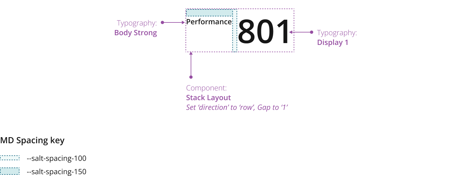
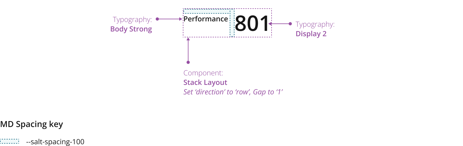
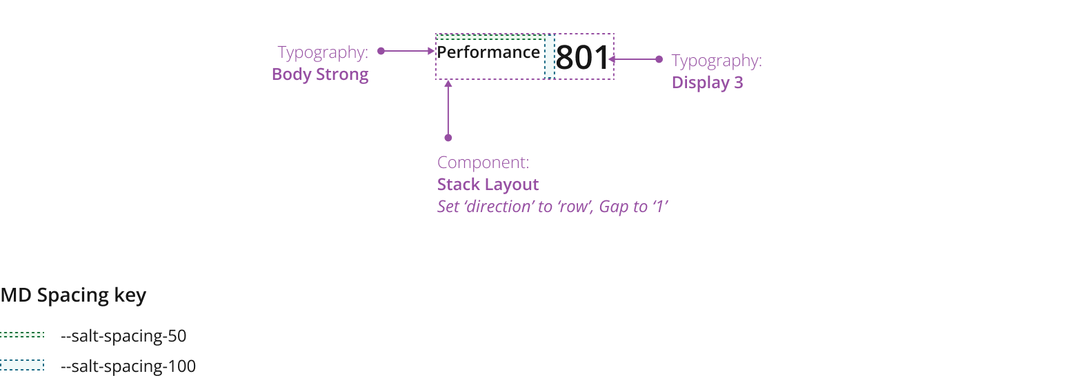
In addition to the title, you can display a supporting subtitle and/or subvalue within a metric. Use this to provide more context and improve users' comprehension of a metric's value and impact.
Place subtitles directly beneath the title, and subvalues beneath the key value.

To give more context about a metric value, such as whether it is positive or negative, use the subvalue to provide past data, average, threshold or target values, or comparable high or low values.
Display a link in the metric's subtitle text, enabling users to navigate to another page with related information.
Enable users to navigate to another page by linking from the subtitle.

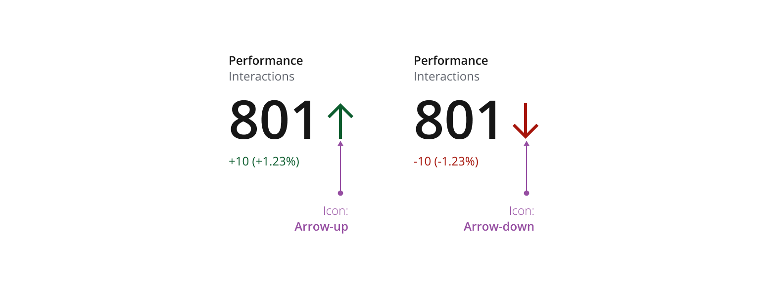
Use indicators to provide further contextual information. For example, if the metric value represents a change from a previous value, such as a positive or negative trend, you can display an arrow icon as a strong visual indicator of the direction of change.
If you need to expand the pattern or share feedback with us, please contact the team.