Vertical navigation
Vertical navigation provides users with a structured and intuitive way to navigate different pages, sections or features of your website or application. It's often on the left of the viewport and organizes links into a single or multilevel structure.


Use vertical navigation when the page needs a persistent navigation pane that organizes multiple sections of an application into a vertical hierarchy.
Use it when:
- you need multiple top-level categories that represent the main sections of your website or application
- the information architecture is complex enough that a horizontal nav would be crowded
- the navigation should remain visible as the user moves through nested content
- clear labels or icons can help users scan the hierarchy quickly
- When the page only needs a small number of top-level destinations, use a simpler horizontal navigation or app header.
- When the navigation is secondary or page-local, use an anchor-style table of contents instead of a full navigation pane.
- When the content is primarily modal or task-oriented, use a dialog or drawer structure instead of a persistent sidebar.
A vertical navigation uses the VerticalNavigation component family in a persistent navigation pane:
VerticalNavigation: Labels the navigation region and owns the item list.VerticalNavigationItem: Represents a destination or expandable group. Only one destination should be active at a time.VerticalNavigationSubMenu: Contains nested items revealed by an expandable parent trigger. The parent expands the group rather than navigating.
You will typically use vertical navigation in a sidebar, on the left side of the screen, within a drawer, or a parent-child layout.

You can use left-aligned icons to effectively signify the navigation item’s purpose, whether it’s related to a product’s identity, a specific tool, a function or a configuration setting.
VerticalNavigation owns the column layout and spacing between its items. Keep the hierarchy wide and flat.

A single-level vertical navigation group provides a simple list of links that users can select within an application or website. Use VerticalNavigationItem with a destination-backed trigger for each link.
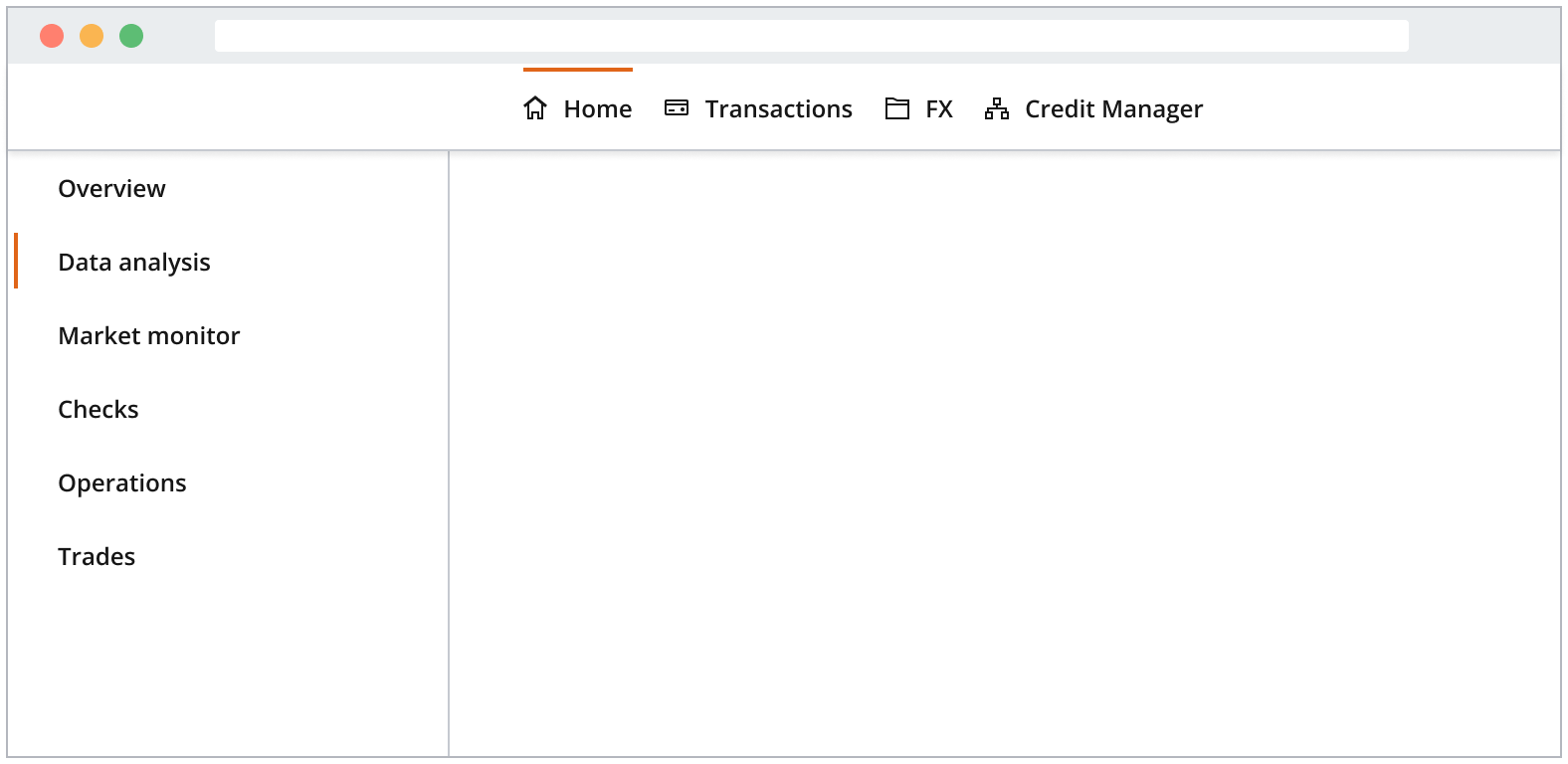
Nest VerticalNavigationItem entries inside VerticalNavigationSubMenu to create a multilevel structure.
Top-level hierarchy items labels use a strong font weight, and nested items use a regular font weight.
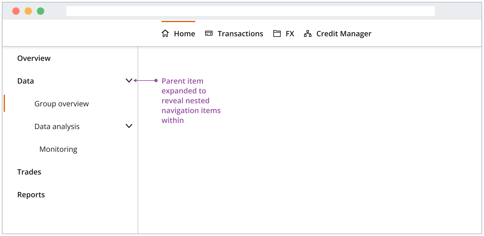
- Surface the hierarchy of your application’s information architecture to as few levels as possible. Maintain a wide and flat hierarchy instead of one that is deep and overwhelming.
- Clicking a parent item does not navigate the user but expands the group. If an overview page is necessary, make it the first item in the group. Overview pages do not include a chevron on the right-hand side.
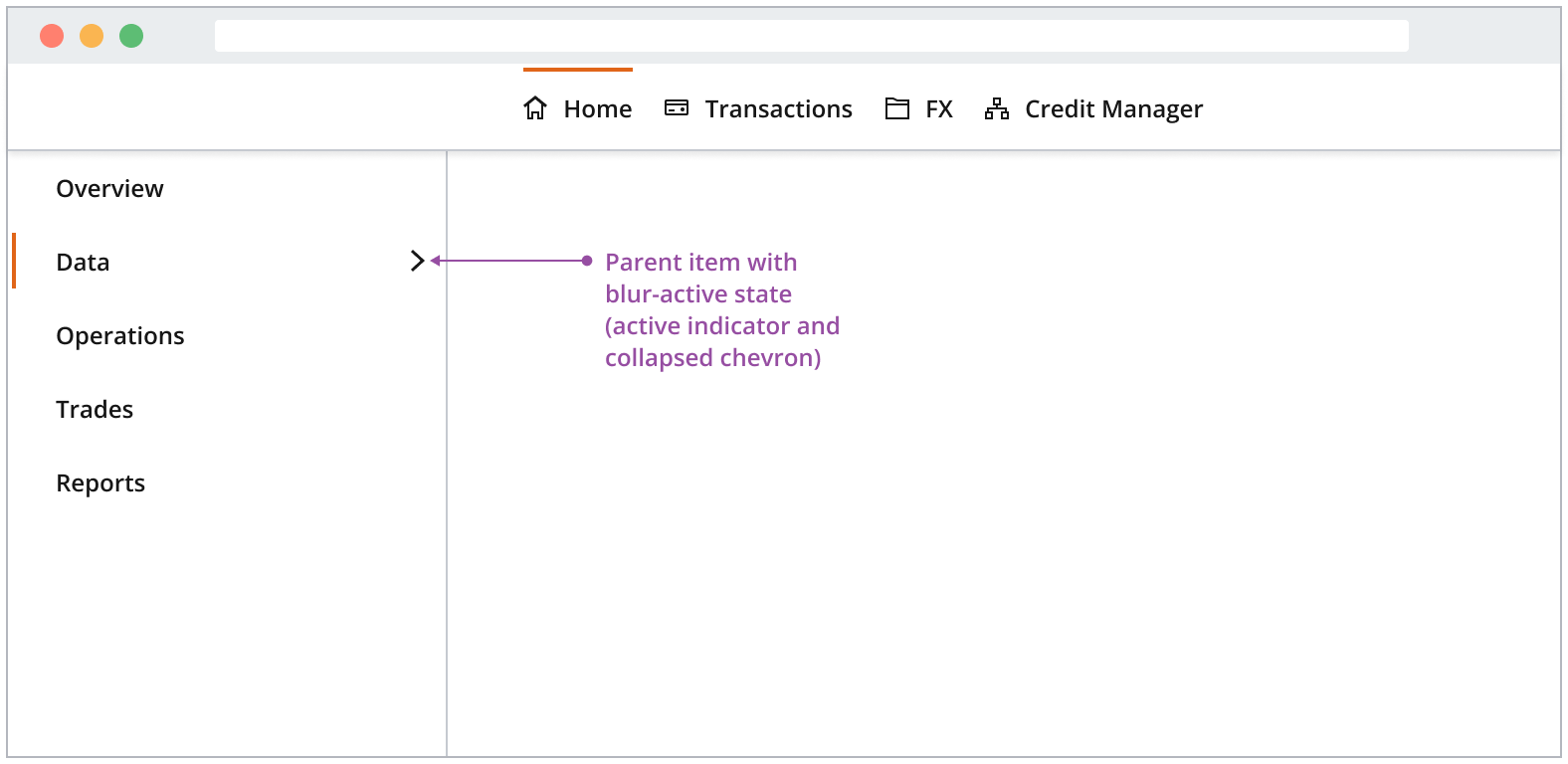
When a parent item is collapsed but contains the currently active page, the parent is shown with the active indicator.
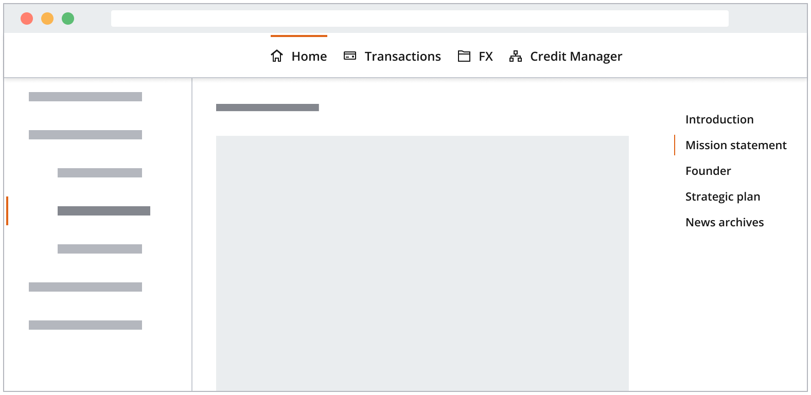
You can use VerticalNavigationItem triggers as anchor links within an application view, allowing users to navigate swiftly between various sections on a page. Typically, it functions as a top-level table of contents for the application.
We recommend using a density that is one size smaller than the main navigation. This is particularly applicable when:
- It isn't the primary means of navigation for the entire application and doesn't need the same level of prominence as, for instance, the left-hand navigation.
- A smaller density helps visually signify its hierarchy within the page.
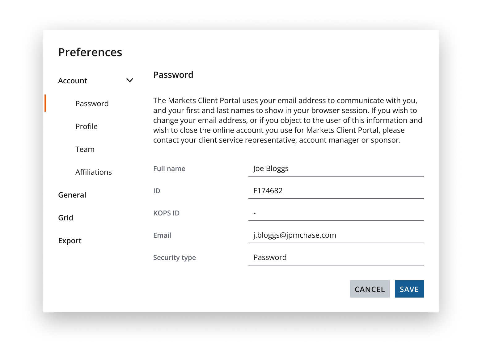
Modals such as preferences dialogs can contain a vertical navigation to allow users to navigate between distinct panels of content within the dialog.
Refer to the preferences dialog pattern for further guidance on how to manage navigation within application preferences modals.
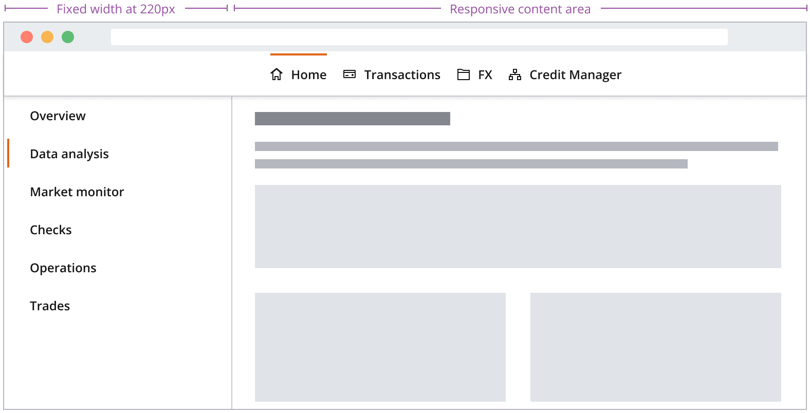
A vertical navigation remains fixed in width when the user resizes the browser. You can set it to the width of your choice, but you should consider the overall label length, theme, density, and screen size you are designing for when making your decision.
If you need to expand the pattern or share feedback with us, please contact the team.