App header
An app header is a consistently available element that sits at the top of every application interface. It contains a brand logo or mark and application-wide functionality, including navigation and utility actions.


Use the app header as the top-level, globally persistent shell element that orients users within the UI and exposes app-wide navigation or utilities.
Use it when the page needs:
- a persistent branding area
- application-wide navigation or utility actions
- a compact top bar that stays visible while the user scrolls
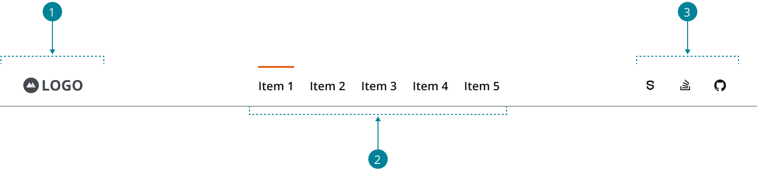
The app header has three functional areas that should remain recognizable in both desktop and mobile layouts:
- Branding: Displays a brand logo or mark followed by the application name in text form. This should always link to the product’s homepage.
- Primary navigation: Serves as the container for the top-level navigation. Its inclusion is optional if you have a persistent side navigation or only a single page.
- Utilities: Provides access to persistent application-wide utilities, such as external links, search, notifications, help, account details, and settings.
-
Use
NavigationItemto build the horizontal primary navigation, as explained in the navigation pattern. -
Use
FlexLayoutwithjustify="space-between"to position the branding, navigation, and utilities.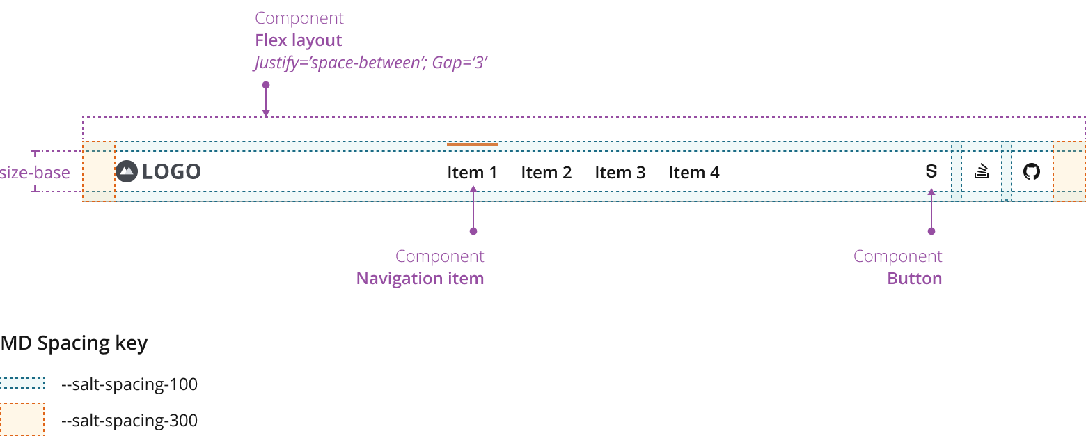
-
Use
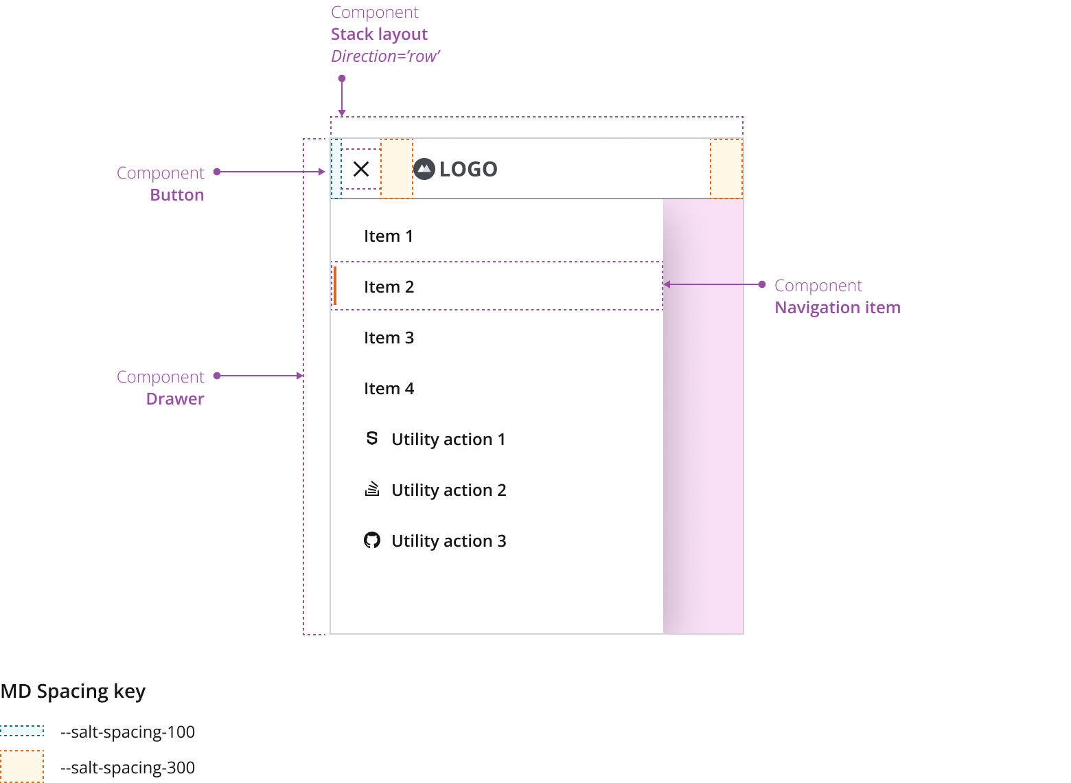
StackLayoutwithdirection="row"to position the menu button and the logo. -
The menu button opens and closes the navigation drawer.
-
Use a stack layout to position the vertical navigation and utilities within the drawer.
- When the header is not globally persistent, use a smaller section header or page title instead.
- When the navigation needs multiple levels and the shell is primarily a sidebar, use Vertical navigation as the main navigation surface.
- When the page only needs branding without app-wide actions, use a simpler brand lockup instead of a full header.
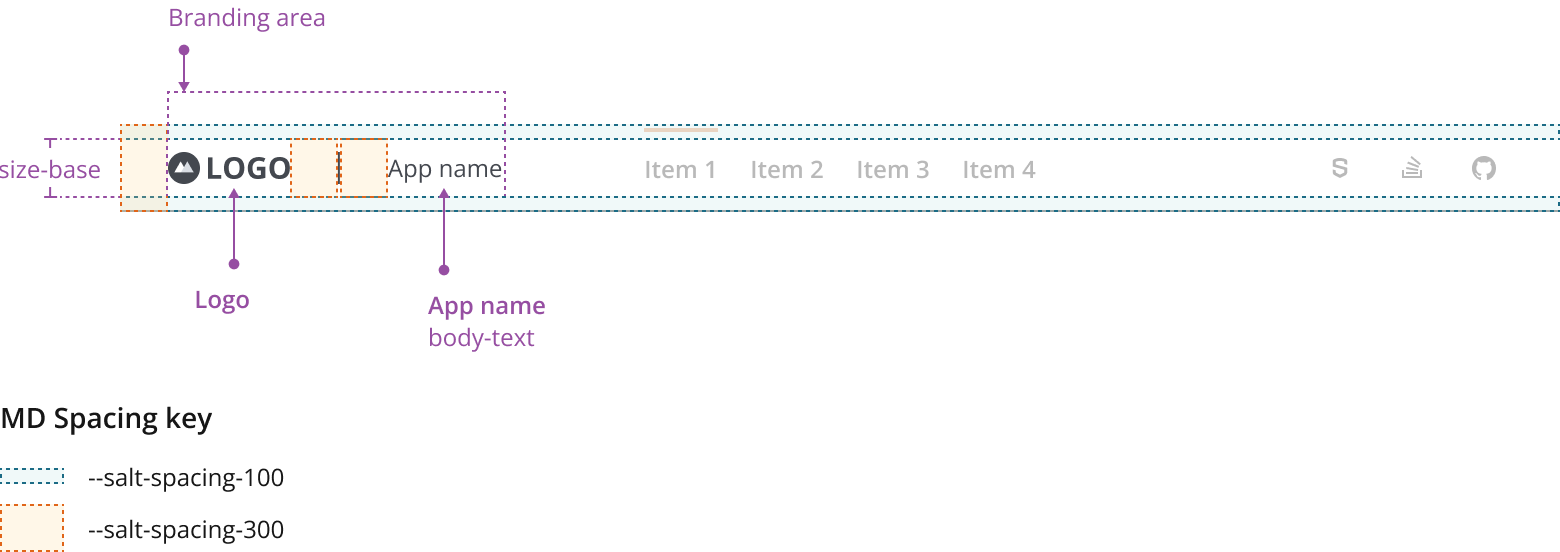
Always place your logo on the top-left corner of the application. It can be preceded by the app name in text form as part of the branding area. This area can vary in size and composition where:
- The max-height follows the fixed default height for base components in each density —size-base.
- The width responds to its content —standalone logo; or logo & app name together.
Refer to the J.P. Morgan Brand Toolbox brand guidelines if using an authorized J.P. Morgan logo.
Consider the following when placing your logo in the app header:
- Keep the aspect ratio of your logo when resizing it in each density. Consider visual balance and affordance.
- You don't need to resize your logo to fit the max-height (size-base) of the branding area.
- If preceded by the app name, the text should follow density aware body-text.
- Consider creating a compact version of your logo for small viewport experiences.

- Always place the logo on the top-left corner of the application.
- You can place a title or app name in text form next to the logo.
- Link the logo to the app home page.
- The logo should give users a sense of place while providing a large enough clickable target area.
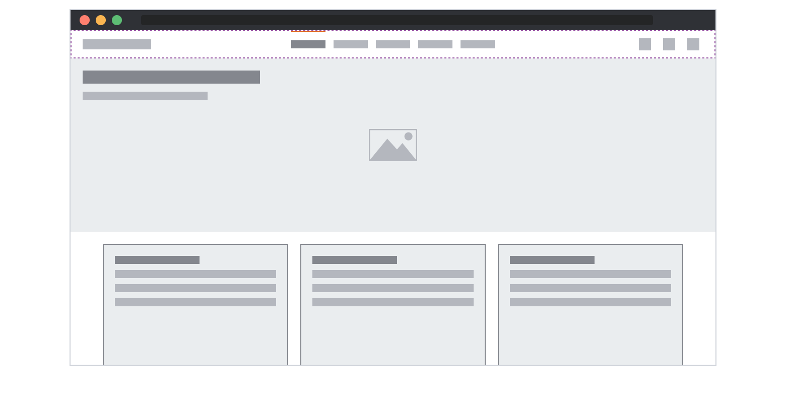
In this layout, the app header is globally persistent. You can use it as standalone navigation for a small number of sections that do not require secondary navigation. Although this layout provides more horizontal space for content, it has limited space for navigation items, and you may need to use combined navigation for complex hierarchies.
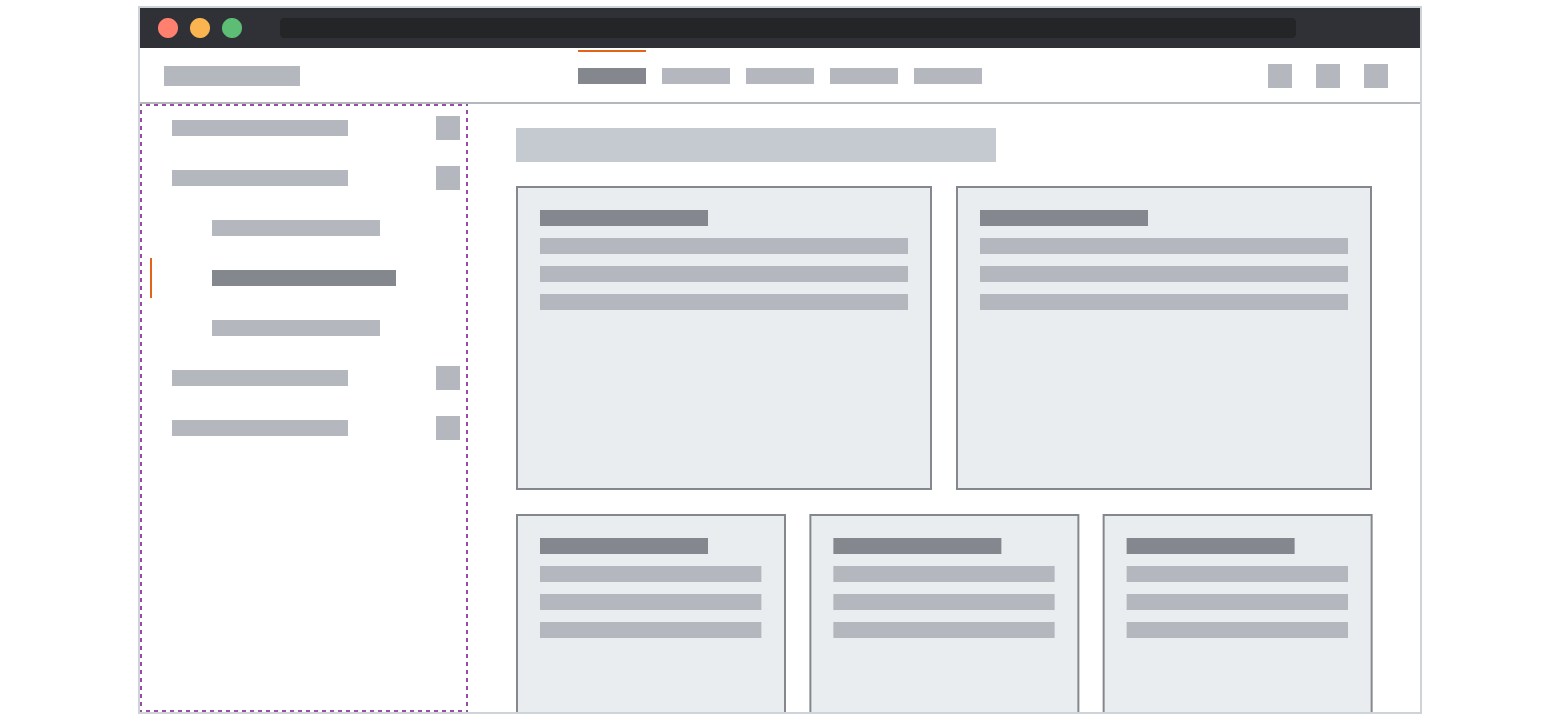
The app header with vertical navigation offers an additional layer of hierarchy. This layout allows users to navigate complex structures and perform system and product tasks in the UI. Under this configuration, submenus can remain on display without interfering with the content. For more details about navigation hierarchy, visit the navigation pattern.
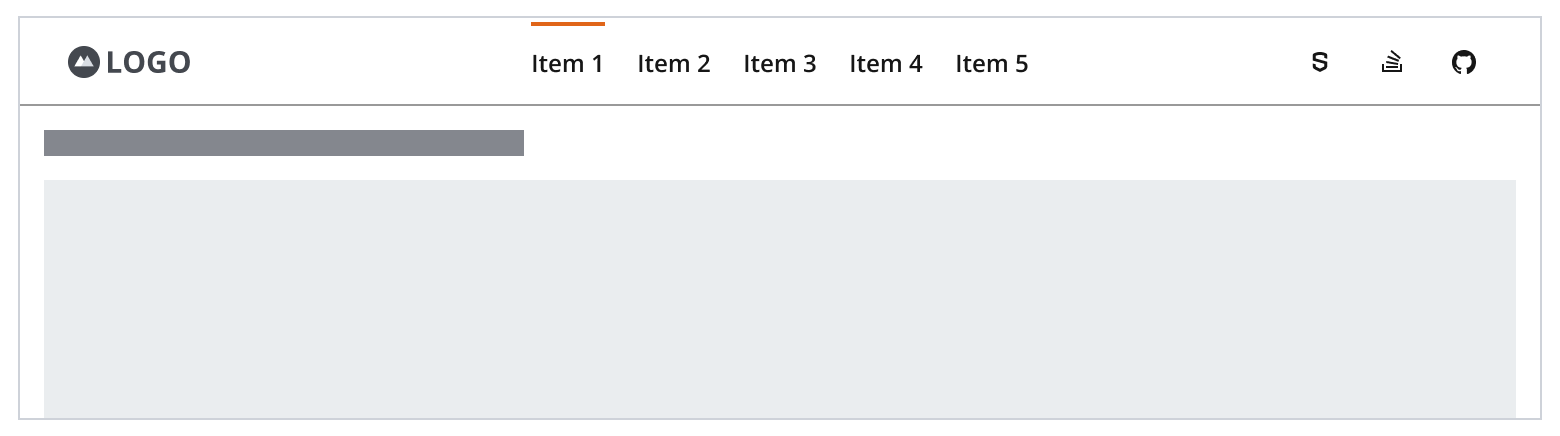
The app header is responsive to the width of the application viewport and responds dynamically to the Salt breakpoints. As the app header scales down to fit smaller viewports, its elements adjust dynamically to provide the best possible user experience.
For small viewport experiences, the app logo remains visible, while navigation and utility actions collapse into a hamburger menu positioned to the left of the brand logo. The navigation items sit above the utility actions in the hierarchy of the vertical navigation.
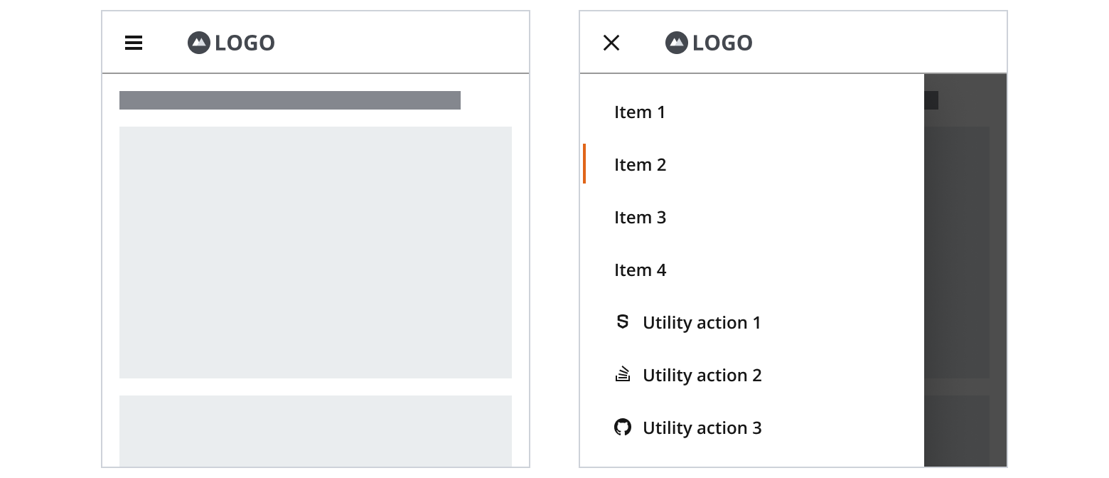
- Navigation items sit on top of the utility actions in the hierarchy of the hamburger menu.
- If a search utility action is part of the app header, keep search functionality persistently available for small viewports.
- Consider medium, large and extra large Salt breakpoints for desktop experiences.
- Consider extra small and small Salt breakpoints for mobile experiences.
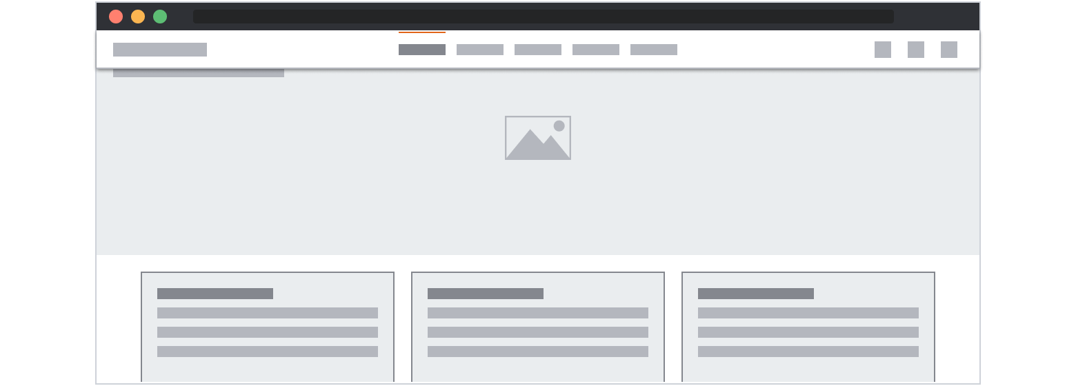
The app header should sit in the north region, above the main, in a sticky position while the user scrolls down the page. This increases the discoverability of the elements in the header, where users can quickly access the navigation and utility actions elements without scrolling up to the top of the page.
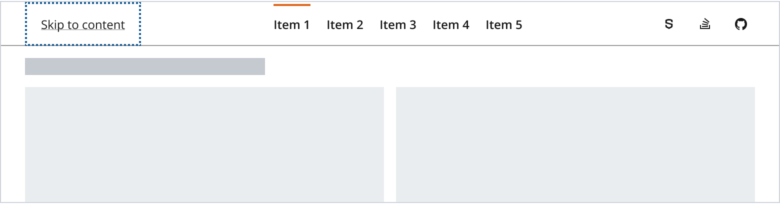
If you're implementing a complex app header with several navigation items and utility actions, you should precede those header components with a skip link. This enables keyboard and screen reader users to shift focus quickly to the main page content and navigate your application more efficiently.
If you need to expand the pattern or share feedback with us, please contact the team.