Preferences dialog
A preferences dialog allows you to display, group and navigate application preferences within a responsive modal dialog window. This pattern introduces guidelines to make the preferences dialog consistent and usable.

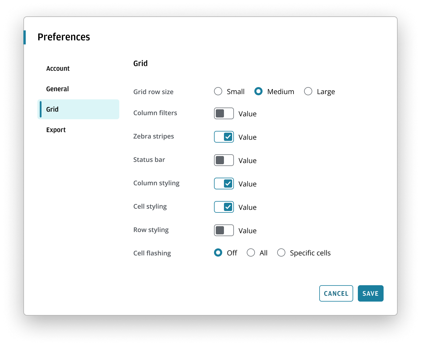
Use a preferences dialog to centralize application or window settings in a single modal workflow.
- Use it when users need to navigate between related settings panels with a persistent navigation pane.
- Use it when a specific window or widget should open directly to the relevant settings panel.
- Use it when preference changes may require confirmation or a consistent apply/cancel action area.
We also recommend implementing consistent behavior around applying preferences, whether applying changes immediately or requiring the user to confirm any changes using the button bar actions.
- When the task is a single, short confirmation or alert, use a Dialog instead.
- When the content does not need navigation between settings panels, use a page-based settings surface or another layout instead.
- When the workflow is not preference-oriented, use a simpler form or overlay pattern instead.
A preferences dialog comprises three key features:
- Navigation pane: a list of links that allows users to navigate between distinct panels of preferences.
- Settings content area: the panel that opens over the application content and focuses the user’s attention on one preference set.
- Action area: buttons for confirming or dismissing preference changes. See the applying preferences section to learn more.
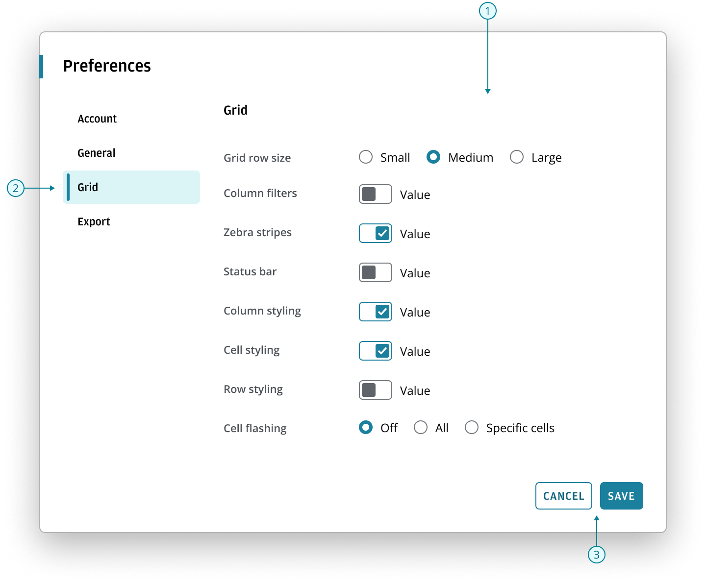
- Use the dialog components as the base structure of the preferences dialog.
- Use a navigation item component to display the left-hand vertical navigation.
- Use a button bar to display any actions at the bottom of the dialog. See the button bar pattern to understand how to implement actionable interactions within dialogs across your applications.
- Use a parent-child layout component to position the navigation and content within a preferences dialog.
Best practices
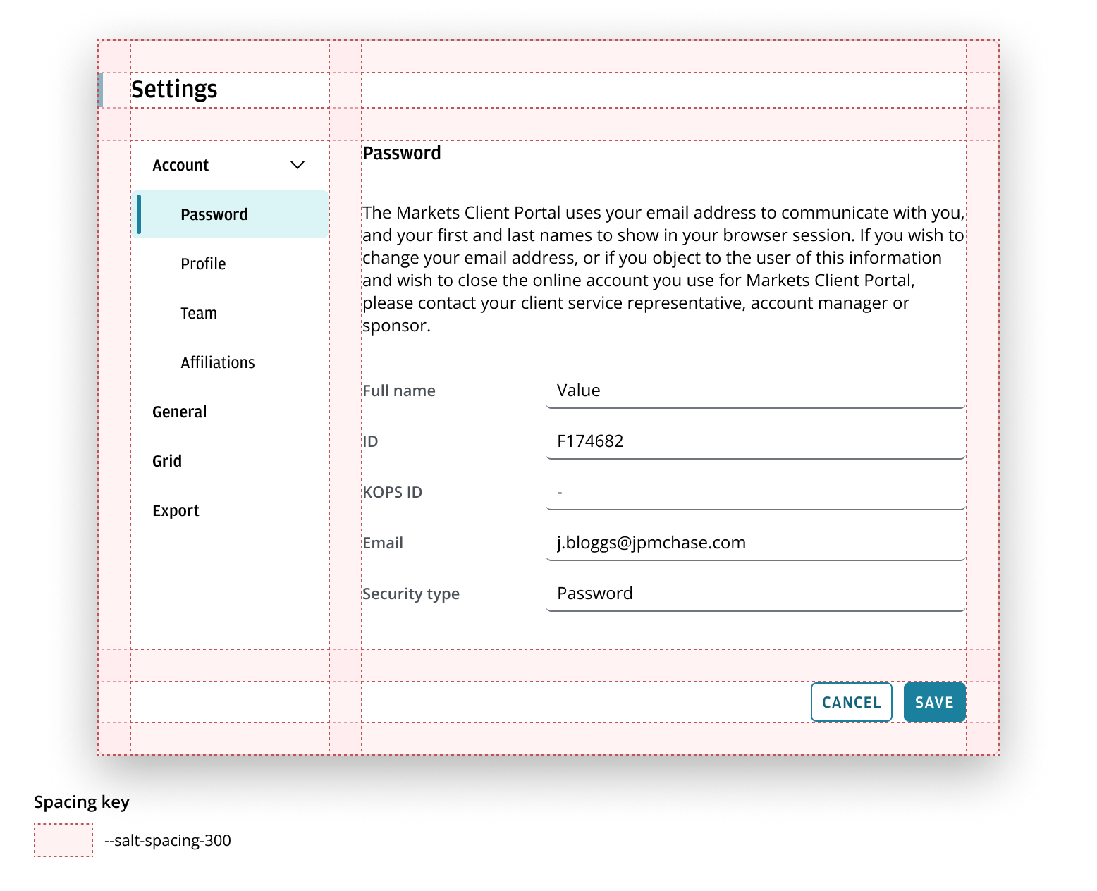
- In the parent-child layout, the parent container (containing the navigation) typically remains fixed in width when the user resizes the browser. You can apply an independent layout grid to align the content with the child container. This enables it to adapt responsively based on the viewport size.
- Limit nesting to no more than two levels, if possible. A deep hierarchy can make it difficult for users to discover or locate specific preferences.
To implement a responsive experience for preferences dialogs, refer to the layout guidance in the navigation pattern.
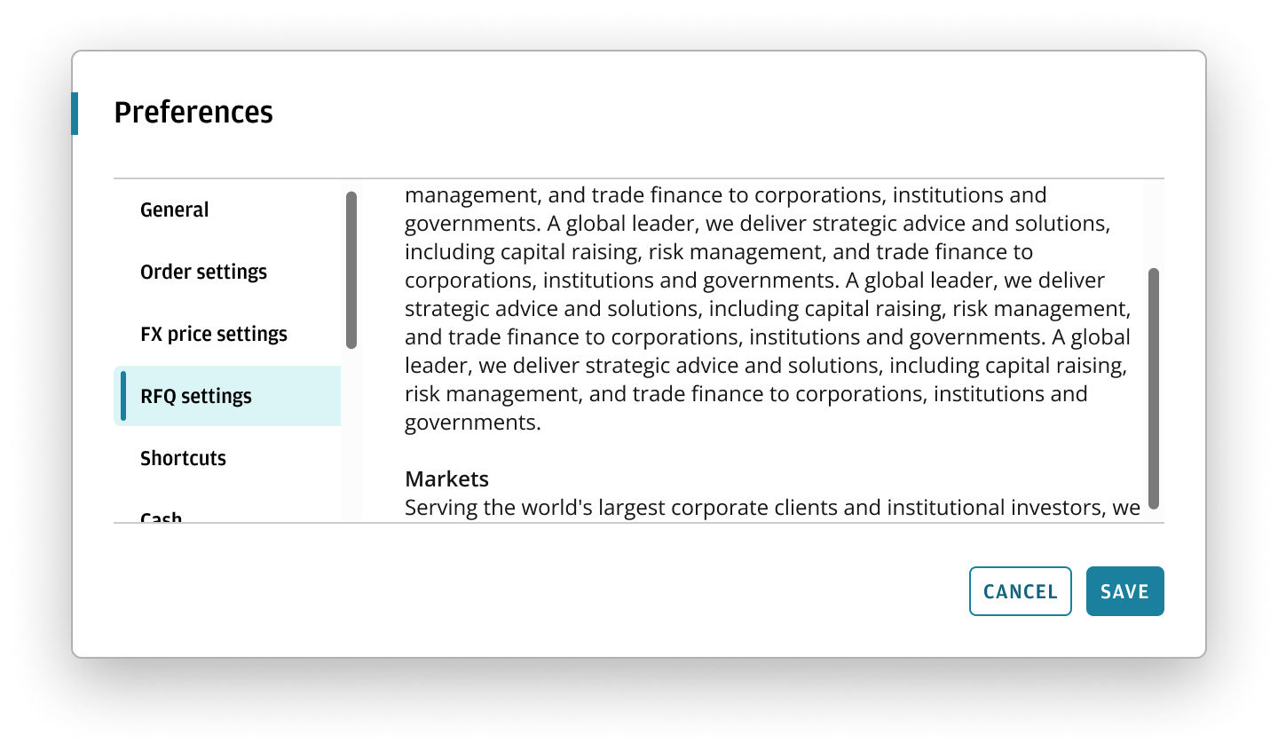
We recommend that scrolling affordance should only take effect if content in the parent-child layout exceeds the visible content area.
This is visually indicated by two separator lines above and below the parent-child layout. Apply the shadow-scroll token for the container shadow.
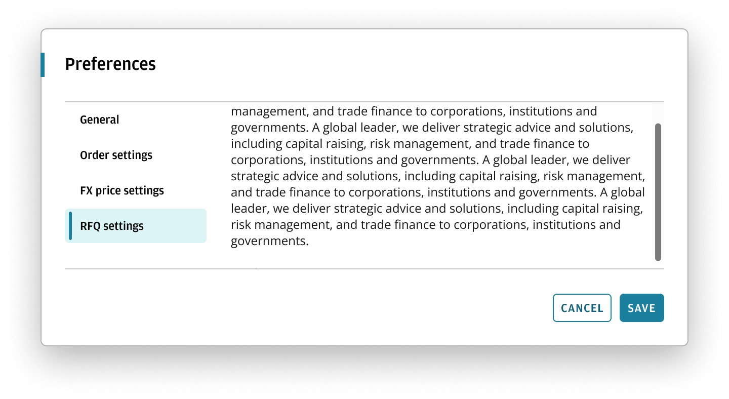
Display scrolling affordance when the content or navigation (or both) exceeds the visible area of the parent-child layout.
Display either a button bar at the bottom of the dialog, or a close button in the top-right. Use the same solution consistently across the dialog.
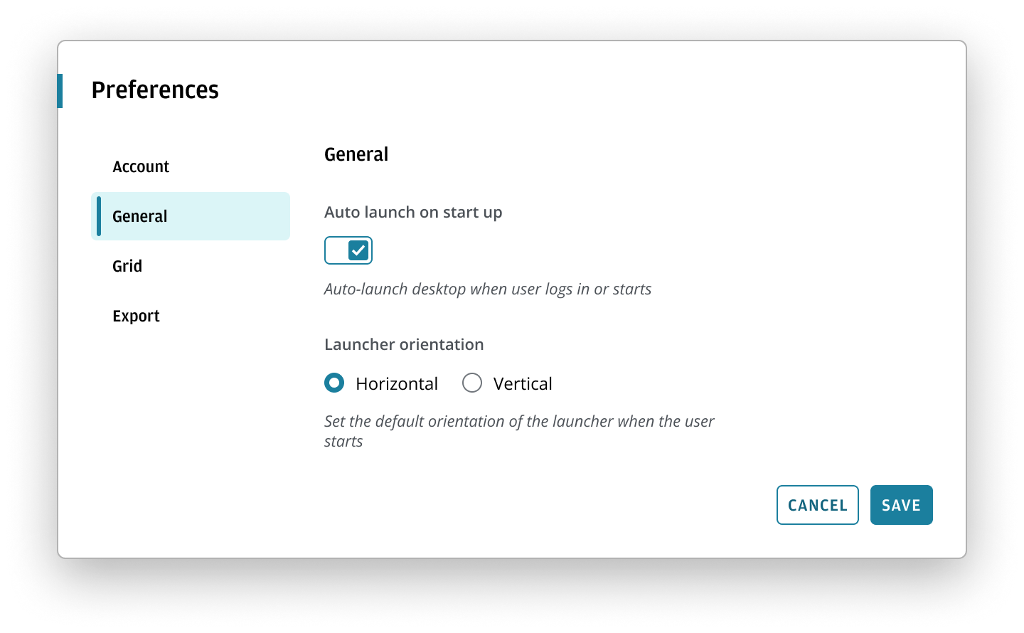
Cancel and Save button bar actions allow the user to manually apply preferences in the application. We recommend this when the user wants to:
- Make multiple changes with ease and apply them simultaneously.
- Easily cancel any unwanted changes.
- Change technically complex or performance-intensive preferences.
- Change preferences that can't take immediate effect for any other reason.
Best practices
Display core actions to the right of a dialog. Refer to the button bar pattern for further guidance on how to display user actions within dialogs.
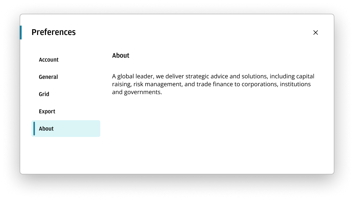
If your preferences dialog does not need a button bar, instead display a close button in the top-right corner of the dialog. This allows the user to close the dialog after editing any preferences. Changes should take effect as soon as the user changes a preference.
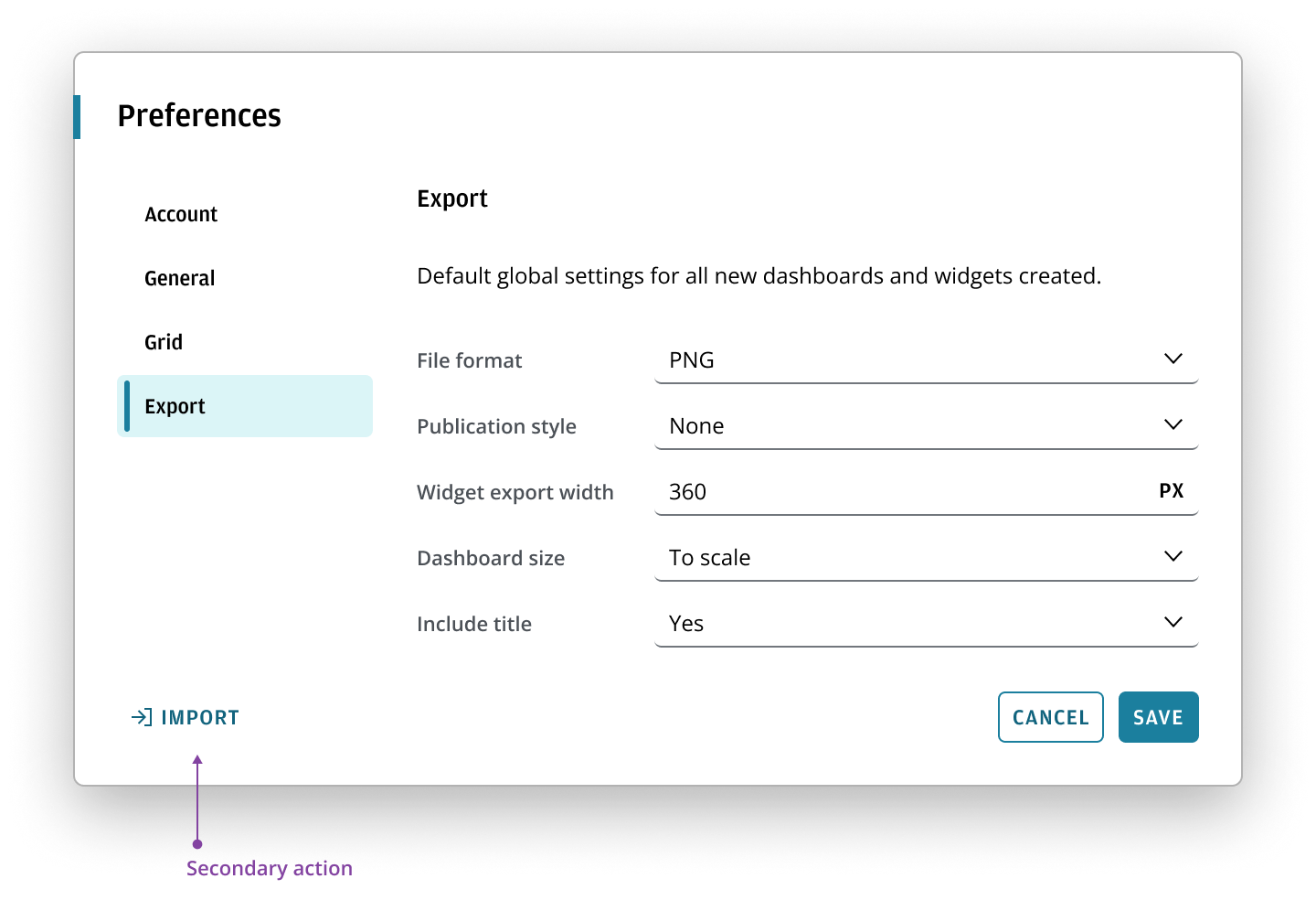
We recommend configuring the button bar to display secondary actions to the left such as Import and Export if you need to enable other actions.
The preferences dialog is responsive to the width of the application viewport and responds dynamically to the Salt breakpoints.
Once a preference dialog hits a certain breakpoint, you can configure the layout to either:
- Collapse to allow more room for content.
- Change the orientation to stack the button bar.
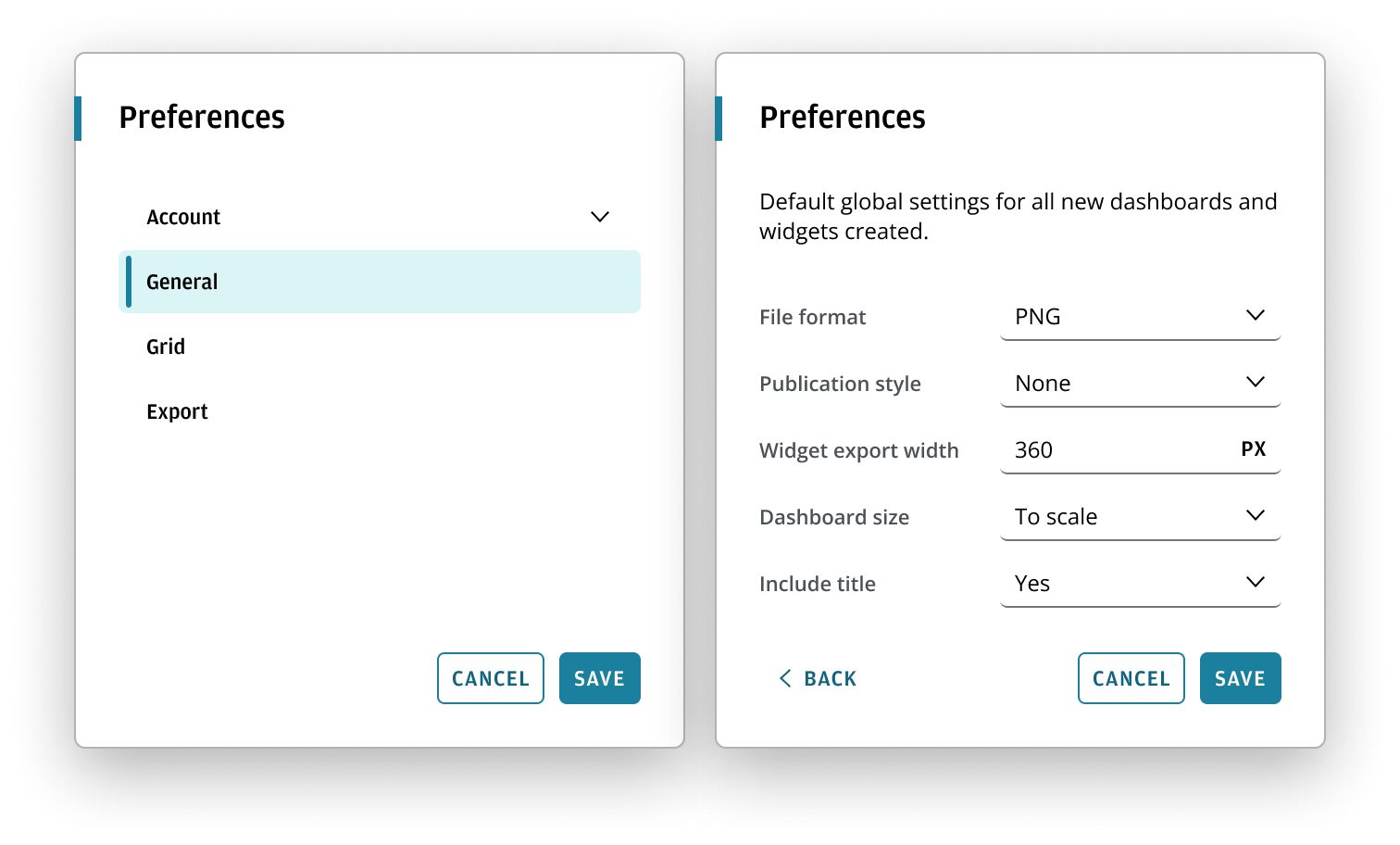
When the navigation collapses, the preferences content spans the entire width of the dialog. To select and view alternative preference types, users should use the back chevron button to navigate back to the vertical navigation. The vertical navigation view also spans the dialog width. A collapsed layout ensures improved usability of dialog content in smaller screen sizes or application resolutions.
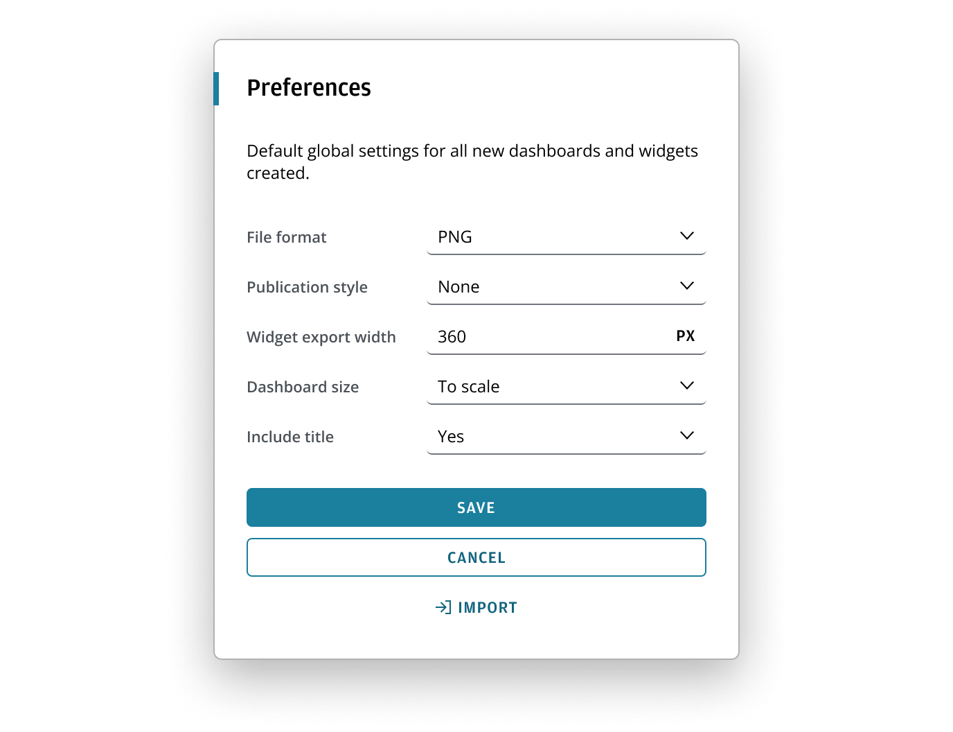
For smaller viewports (i.e. devices with limited screen sizes), it's preferable to configure buttons to stack horizontally at the XS breakpoint. This ensures longer button labels accommodate mobile devices that may not fit within the horizontal layout. They also remain an adequate size for touch interactions.
Best practices
View the stacked button bar guidance to understand how to order and build a stacked button bar.
If you need to expand the pattern or share feedback with us, please contact the team.